The Expansive Romance of Applebloom and Coral Leaf
written by Muffin_Spectacles
This story has been marked as having adult content. Please click below to confirm you are of legal age to view adult material in your country.
Confirm
Confirm
Stats
Page generated in 0.051 seconds
Total duration
834 users online
549,836 hits today, 1,996,409 yesterday
FIMFiction
My Little Pony: Friendship is Magic Fanfiction
Designed and coded by knighty & Xaquseg - © 2011-2024
Follow & Support Us
![]() Support us
Support us
SubStar
![]() Chat!
Chat!
Discord
Follow us
Twitter
MLP: Friendship is Magic® - © 2024 Hasbro Inc.®
Fimfiction is in no way affiliated with or endorsed by Hasbro Inc.®
![]()
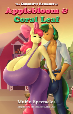
wtf evn is that coverart
7683681
Yeah, the cover art is... physically unpleasant to look at. I admit, I started reading this story fully expecting to hate it, it seemed like a classic wish-fulfillment story masquerading as something else (at the very least, I expect people to be honest with their wish-fulfillment; if you want to write a story about yourself as a memetic sex god, write a story about yourself as a memetic sex god). That said, I was pleasantly surprised.
The first part of the story is easily the best. The sexual tension is quite obviously there, but it's an undertone to a slowly unfolding narrative. The characters were likable, and I found myself actually getting a little excited about the rest of the chapter. Unfortunately, this is where the story stumbles a bit. For starters show us, don't tell us about Coral's endowment, the same way you did with Applebloom's chest. Coral isn't gonna stop to think about something that, for him, has long since become ordinary, unless something happens to draw his attention to it.
Next was the scene with Coral injuring himself, which was... just lame, really, really lame. Have him kick the tree a couple of times, have him fail, if he really has to be injured in that scene, then have him do something colossally stupid in an attempt avoid emasculating himself in front of Applebloom, like drop-kicking the tree and landing wrong. If you kick something so hard you pass out from the pain, then you've probably shattered every bone in your leg, which should be impossible for an Earth Pony kicking a tree unless you have osteoporosis or something.
Finally, the way he learns that his upper body strength is good enough to knock down apples is kinda silly (and also contains the truly unfortunate implication of him using his dick to applebuck, YEOUCH!). Have him go out after dark and try kicking the tree again, have him try and fail again and again until he gets really frustrated and just bangs on the damn thing with his arm. Boom, he discovers his own method of applebucking and he doesn't have to leave in the morning. He wouldn't get the kiss with Applebloom quite so soon, but his sudden epiphany would certainly be more natural, and flow far better with the rest of the chapter.
All-in-all I think this story has potential, and seeing how it already plays into some of my favorite fetishes, I'm interested in seeing where things go from here.
I completely agree with Socks and Blackground. Also Shocks and Background.
While the cover-art is indeed "ehhhh", and the part of Coral injuring himself is cringe-inducing, I'd be lying if I said I wasn't looking forward to more.
Honestly, I enjoyed it enough I could keep following this. Others have already laid out areas it can be improved upon, but I did like that it's actually laying out a foundation for some actual story. It's not one I'd suggest for someone looking for a quick clop fic, but sometimes it's worth it to build up to that, and I'll hang around to see if this one's worth the wait.
7689523
"It's not one I'd suggest for someone looking for a quick clop fic, but sometimes it's worth it to build up to that, and I'll hang around to see if this one's worth the wait."
That's generally how I roll. I used that same method with a comic story on Deviant Art with another fetish of mine, and many were chomping at the bit when I wasn't giving them the quick-and-easy-fix they were used to.
Normally, I won't even attempt something, unless I don't see what I'm looking for out in the wild. I'm somewhat cultivating a few other possible expansion-related story ideas (may not quite reach for the stars like my first attempt), but I'll have to see if my mind can come up with enough to make them worthwhile.
I've been staring at this coverart for like 3 days and just noticed the giant third leg of Coral leaf
7689619
And yet, noone can tell me why I am getting such grief over it.
I assumed it was my aping of romance novel covers, or some were offended by AB being a 'big pony.'
If it's the faces, I find that rather odd, as I based the facial designs on the flash-based head designs, not making the muzzles as prominent, and a bit more like a nose that an extended nose/mouth portion.
7689691 oh God the faces they look like they have pig noses.
7689691
This is a writing site, not an art site, which would explain why you're not getting any real feedback on the picture, but I'll try to deliver.
If I had to put the weight of anything turning me off of this cover art it would be Applebloom's up-turned face. While there's nothing overtly wrong with it, it's just generally unpleasant to look at. I mean yes, I can see the homage to the great "Upper class lady meets hot stable hand" Bodice ripper harlequin romances in this cover art, but like a child in his fathers clothes you're lacking the substance to fill it out. (I think this simile stands up, probably could phrase it better though)
If I had to do a far deeper analysis (and I do, my brain won't shut up otherwise) there are several compounding problems.
First off - That background's great, if cliche, up until the midpoint/the bottom third where the hazy, watercolour painting style just sort of gets dumped into a blob of greens and browns, which I'm fairly certain is just the Paint/Photoshop blades of grass bush, and the two styles clash, hard, which draws the eye to the break .
Secondly - The faces, ugh, those noses. Not going to beat around the bush, it feels almost like I'm looking at Muppets rather than Anthro ponies (Miss Piggy and a misshapen Fozzie Bear to be exact). Even if that was fixed, the closed eyes is a serious no-no in romance cover art. You want the eyes open, it implies a connectedness, even if AB's posture suggests she's moving away, open eye contact helps suggest something more, a brushing touch, subtle and loving.
Thirdly - The proportions are all out of whack; not on the hyper bits and bobs, proportion flew out the window a while ago for those, but on the hands, arms, and shoulders are all off. Especially the hands and fingers. Coral's one hand looks like it belongs on someone ten years younger, while AB almost literally doesn't have a shoulder, and her dress is cutting through her armpit by what looks to be about an inch of flesh.
Which brings me to Fourthly - The clothes look terrible. Not just bad, terrible. They stand up against a light look (so the picture above) even if the highlighting and shading is amatuerish, but if you click on the picture to get a better look at it (as I tend to do with all story cover arts) they are flat out terrible. It looks like you've tried to use some sort of detailing brush to bring out the details of the fabric on both the shirt and dress, but it simply doesn't match with the rest of the image in any way shape or form. The shirt's collar doesn't actually exist, and what should be folded back "lapels" are fuzzy blobs of highlighting and shading, a problem that is shared with the sleve roll-up, which makes it look like Coral put on his younger brothers work clothes. The jeans are an obvious photoshop splice job, I can literally see wear you've edited the bulge using a different picture given the colour change and the blurred join line. The belt is absolute crap as well, just a flat brown, without any detail such as a trailing tail, or BELT LOOPS (that part I personally find inexcusable, but that's a personal quirk).
(Still on clothes) And then there's AB's dress.
Oh god, is there AB's dress.
I'll assume you were going for something tight and clingy, almost like Jessica Rabbit's dress. You failed. There's the aformentioned cut into AB's arm pit. You're missing a second strap which should be fading away under the hair, but it's just missing in its entirety, there is an active distortion of fabric in the shadows under AB's breast that makes it look like she's got three tits, and the legs of the dress should not be falling straight down, instead following the countours of her hips to about mid thigh before it loses distinction. As it stands I first though Applebloom was the one with a hyper cock in this story. In no way, shape or form, is this sort of thing passable.
I'd say that this coverart was worse than those people who just use pony maker and paste those into their cover's, but this does have effort and time put into it, so I can't say that in good faith, but it does skirt the line damned close to that point.
Ok, fine, I took down the cover art. I have stopped traumatizing people with my horrible art skills.
7690861 Hey. Just because some people want to show distaste towards your art doesn't mean it's bad. I personally loved it. It had a sensual feel. And to the people who said their art wasn't needed: go see a good bit of this site; it is loaded with either custom art or commissioned for the story. In other words, stfu and just read.
7690799 Exactly. its a writing site. not an art critique site. go to deviantart for that shit, mate.
7690799 Did you not read the author's notes? This is their first fanfic. I personally thought it was good, but if you cant be appreciative that he/she took their time to put this on this site, then don't read it. Others will and they will like it.
7694012
The last paragraph.
I used to draw. I was never very good at it, but I would've killed for a critique that wasn't just pointing and laughing, or going "oh that's very nice".
I appreciate time and effort, because I understand putting in time and effort.
That doesn't mean the picture is good and I have to give it a thumbs up.
Same for it being "His first fimfic". That's an excuse, not a reason. No I do not expect writing genius from anyone's very first story. I expect competence, and this story is at least a 7/10 in people's first stories. Whether you want to take that as damning by faint praise, or the fact I honestly expect this guy to only get better as he goes, because it's damned strong start. I can't control how you interpret my comments.
Although I will point out I only commented on the cover art, not the writing, which I enjoyed.
As for this...
...If you think cover art or illustrations are not an important part of writing when they show up then you need to understand the power of first impressions in literary circles. Coverart is the first impression you get of a story, even before you pick it up and read the blurb.
Quoting BackgroundNoise
Yes, the short descriptions that are on the story links do take on the part of first impression, unless you're in the feature box, but I know I've avoided other stories because their cover art made me think they were low quality, and read utter piece of crap because they had spectacular cover art.
7694125 Here's the thing. I understand the cover art is important, but is giving the criticism worth the author thinking his art is crap? Why not, instead of posting it on his story, pm him so as to tell him what he did wrong and, if you actually care for his success, let him know how he can improve?
Decent start. I like a good slow build every now and then. Good bit of foreshadowing with the popped button. Are you going for slow growth? There aren't enough of those around for my taste.
One thing though. There are a couple times where you wrote Applejack when you meant Applebloom. I think it was in the apple bucking scenes and in one of the meal scenes. Don't remember exactly.
I look forward to more chapters.
7702461
Yes, this is a story after all. I've seen plenty of horrendous expansion stories that try to get right to the expansion, often discounting the expander having a personality. There is also that over-used bit, where the girl has "always been fascinated by ____________, and dreamed of what it would feel like." To me, that line has always reeked of "immediate male wish-fulfillment," and I've seen it pop up many times in stories I've read or skimmed over the years.
I feel 9 times out of 10, if a girl's body is not acting as she wishes it to, she isn't going to be fascinated by it, she's going to be apprehensive, and a bit wary of the changes happening. In some cases, it's something she needs to work through.
My goal whenever I write something, or consider something creative, is to do something that hasn't been done, or is rarely ever done. Coral Leaf's commissioned art pieces, seemed to hint to me of a very unique love story, and the images just ignited within me a curiousity as to what could have led the two together. While the O.C. Is Coral Leaf's, there's a bit of my own personality in there.
So far, you're one of the few breaths of fresh air, that has not torn into me with sharp talons (and it's only been the first chapter!). This is a story I'm looking to walk the knife's edge in making it somewhat dramatic, but also reveling in the ridiculousness of ballooning bodyparts.
Of course, on DeviantArt, I was labeled "A Pretentious F---" by one person regarding some of my viewpoints and where my particular focus on expansion was going. I can't help but wonder if that label is going to follow me around here too.
7702814
Try not to let those types get you down. Write what you like, keep improving, and fans will come. I've always been a fan of stories that actually have story to them.
Honestly, why focus on cover art when this is a fan fiction site?
7703775 Exactly.
Great writing! Hope this prospers!
you should make more chapter this is a good fanfiction o and also good fanfiction
Holy haters, batman. I know everyone's a critic but I've never seen that be so literal before.
Look. I'm just here to get off, and this story is mostly here for that too. So far, mission accomplished. Ignore the people whining about the cover art which you didn't do, especially because holy shit there are more people commenting on that picture than on your actual story.
I'll be honest, it's not the best I've ever read, but it's well up in the 7/10 territory, even 8/10 depending on how... expansive things get. I'm definitely excited for more, and I've read all five chapters so far. I only came back here to comment on chapter 1 to try and balance out the huge stick up the comment section's collective asses so far.
Only suggestion I'd make is to try and give some references here and there, like size comparisons. It took me a while to figure out what size Applebloom's boobs actually were at the start, since I was expecting them to be like the cover picture but then realized they weren't that big yet. Even comparing them to other body parts, length of arm, size of head, yada yada, helps a lot. I like everything else I'm reading, and can't wait for more (in both ways.)
Keep going strong, man. If no one can give you a good reason why it's bad, it's probably not bad.
Edit: Don't pay any attention to any labels anyone on deviantart tries to give you. Deviantart is pretty much a pile of clueless circlejerking teens, and most of their insults should be taken as compliments that you're not their kind of loser.
Not, bad. I gotta say this was a pretty good start for something that emphasizes hyper breast. Not just mindless sex scenes though and through, but an actual story with endering characters, just with a bit of a mature touch to it. I really wish there were more mature stories like this with actual story. Hope this will continue to have great story in the later chapters as well.