Jul
4th
2015
Dear IDW Publishing... · 1:01pm Jul 4th, 2015


LOOOOOOOOOOOOONG LOOOOOOOOOOOOONG MAAAAAAAAAAAAAAAN!

Page generated in 0.049 seconds
Total duration
745 users online
803,866 hits today, 2,782,760 yesterday
My Little Pony: Friendship is Magic Fanfiction
Designed and coded by knighty & Xaquseg - © 2011-2024
![]() Support us
Support us
SubStar
![]() Chat!
Chat!
Discord
Follow us
Twitter
MLP: Friendship is Magic® - © 2024 Hasbro Inc.®
Fimfiction is in no way affiliated with or endorsed by Hasbro Inc.®
I respectfully disagree.
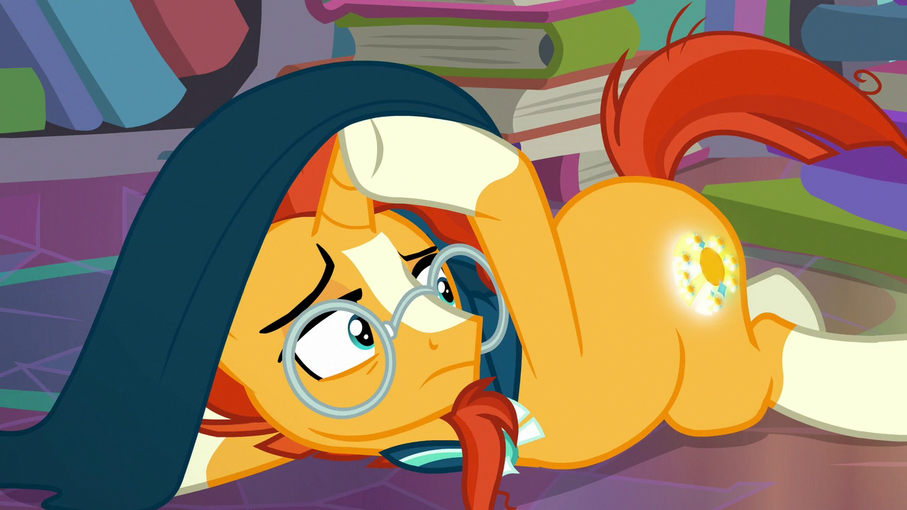
3205225 What, you LIKE your ponies shrunken, babified, and with massive, bulbous Huey, Dewey, and Louie heads?
I don't like this style at all. It doesn't help that stories in those issues are also quite lame as well.
3205232 Finally, someone's makin' sense. I do not like this art.
I like this artist. It's different style from what we see on the show or even the other comics, now if the show had an episode animated in this style I'd be annoyed, but for a comic book it works well for the stories the artist has worked on.
3205232 Yeah. Issue #18 is especially terrible. It's a sweet little fluff piece and all? But it's just so BORING. It's 20 pages of Fluttershy freaking out and 1 page of her finding out she had no reason to freak out, and absolutely nothing else.
I dunno, I think it's kinda cute. Besides, I've seen wierder art styles from fanmade comics. This is really no different in my opinion.
Are you kidding, I love this style
3205229
quickmeme.com/img/f2/f2242743b97f61442b2a80c824e4dc0474bcafacbe2e377599689cdd5338c999.jpg
Aren't you a bit rude? You are literally asking IDW to fire someone only because you don't like the art? (I'm not saying I like it, I prefer Andy Price.) But you are literally spitting on this artist's work.
Okay just to clarify, I know there are various different artists.. Was this one Andy Price or no? There are so many MLP comics that I tend to get confused sometimes.
3205248 Not to mention, there's tossing Spitfire into a pointless cameo that only further damages her character. If she went to the same flight camp as Rainbow Dash and Fluttershy, and is around their same age, that means she either:
A. Was a bully to Fluttershy
B. Was ignorant of the torment Fluttershy endured
C. Did nothing to stop Fluttershy from being bullied
It's like the writers don't even bother to think through their stories to make sure it makes sense. And on top of all that, FlutterDash is already done in the show pretty well, and we all know how the pairing works. Same goes for TwiPie and RariJack. People read the Friends Forever series to see pairings that the show either doesn't use often, or has never considered using.
3205271 It's Jay Fosgitt.
3205270 The art style is terrible and looks jarringly bad. I'm not the only one who thinks this.
(And if I seriously expected my opinion to matter, I'd be sending e-mails to IDW, long detailed letters explaining why this artist shouldn't work on this series, etc. etc. but I'm not doing any of that. I'm just blowing off steam. In the end, it amounts to a month of anticipation, 5 minutes of disappointment, and little else lost from my perspective...I just have to keep praying the next one won't be terrible each time we get one like this.)
3205318
Ah I see. Thanks for clearing that up, I actually do enjoy Andy Price's style having looked at it. So I was rather confused to see this art work instead. At least the main comics are still pretty good. (Brother just bought the Fiendship is Magic trade, that's all rather exciting!)
3205318 The only times this style is used is when both of the main characters are Pegasus. That should mean the next one with two Pegasus might have this style again.
Really? I don't much mind this style. Granted, I don't read the comics, so take what I say with a grain of salt, but I think this artist is fine. Not to say that it's godlike, but I don't think it's as offensive as you think
3205318 Well, there's a YouTube channel that let's you watch the comics for free. That way, you can know in advance whether or not you want to buy an issue. I'm personally gonna be skipping this one. It's really weak and pretty boring.
People still read them?
Huh.
Don't know about you but from this one page I actually find it cute and interesting. A different art style is refreshing in my opinion. I mean look at the same comic series by different publishing companies. They're bound to have various art styles, why not the same company publishing the same comic with different art styles from time to time? Just makes sense to me really.
Btw which issue is this exactly and of which MLP comic series? There are a few out now by IDW much like how Archie has a few Sonic series out for different universes and all.
3205565 It's Friends Forever #18.
I like it.
3205676 thanks.
I like his art style. He to me is better then Mebberson, who's art can be hit or miss. Garbowska's art I dont like at all. (Jeez I hope im getting my artist right)
I did like that issue. And yeah there have been some bad issues. Most of the Fiendship is Magic ones sucked. (Cept for Sombra and Chrysalis) Friends Forever is hit or miss. The series had a really rocky start. #16 was okay, I like that Twist reads Locke & Key. (An amazing comic and worth reading) #17 was great.
The main line is a little better. Im behind in it, just finished 30/31 and it was not very good. Comics in general are hit or miss from story arc to story arc, especially if you have multiple writers. They tend to undo the work (either intentionally or unintentionally) that precedes theirs. And all so they can tell the story the want, regardless if it already has been told. And usually better too.
Tweetie bird ponies? Ummm... Nope.
Personally I think this is very rude, if you don't like it so bad then don't read it. It's not like every single comic company has access to the same artists.
3206597 But IDW has several artists who rotate work on the Friends Forever comics, and most of them are much better than this, and this isn't the first time an issue of that particular series has met with this reaction over this artist's style. And perhaps not everybody hates it as much as I do, but I think it's terrible, I'm certainly not alone in thinking it's terrible, and I'm going to complain about it as much as I want to.
After all, that's what the Internet is for.
I like this artist too. Nice to see a toony version once in a while.
Very cute.
Going to have to disagree with your opinion. I think the style is pretty appealing myself, and I like how it emphasizes the faces and the expressions they have.
3205945 As of lately, the comics have been in a major slump. They would probably be a lot better, if IDW actually bothered to edit their stories and hold their writers to higher standards. They're making a lot of mistakes that shouldn't be mistakes (in the sample shown above, the artist is clearly unaware of the colors of the rainbow and keeps coloring them wrong.)
3210573 Total agreement. I'm actually pretty much about to give up on the comics entirely unless the storyline in the next main series issue REALLY wins me back, I've almost given up on Friends Forever entirely, and I just left the comics group here on FiMF last night because I'm no longer even interested in discussing them.
After all, there's still the series itself, fancomics, fanfiction, and Equestria Girls...the declining official comics won't be missed much.
3210585 It's a real shame to see IDW fall from grace like this. How can you go from being at the top of your game, to sinking so low in only a few issues?
3210587 I blame Bobby Curnow ENTIRELY.
3210591 Who is he? Is he the head of the IDW comics staff, or maybe the story editor?
3210592 He's the primary editor on the MLP comics, and the one who seems to have allowed things to fall apart.
3210595 How long's he been on the job for? Because based on when he came around, that could explain a lot about the dip in quality. If he's been around from the start, he's apparently lost his touch and should be replaced.
3210604 At least six months, I think. I'd have to check back issues to know for sure.
3210698 Well, the comics started to slide in quality before he came around, but he's clearly not made things any better.
3210573 Me, I dont tend to notice color issues unless its glaringly obvious, most times I can just pass it off to artistic license. For this issue its all on Fosgitt as he is doing all of the art himself. I still like the style, its expressive and unique. And pony heads always seemed big to begin with anyway.
Story lines is where I think the comic is suffering more then the art. They need a better editor, perhaps stop rotating so many writers and get one or two and thats it. Or better hire some of the FIM authors to write for them.
3210796 They could at least see about recruiting G. M. Berrow from the chapter books, and maybe Meghan McCarthy or M. A. Larson.
3210804
NO!!
That would be the WORST possible thing to do! Berrow is TERRIBLE!
3210847 I wouldn't say that. Her books are far from the worst thing to come out of the show's expanded material. Twilight Sparkle and The Crystal Heart Spell is leagues above some of the recent issues, and that's saying something considering how bad that book is.
3210850 Replacing worse with bad is still bad.
I find this style of art to be pretty freaking adorable, but yeah, I agree. The comics shouldn't be like this. It would be another thing if they used this style as little side drawings, like in manga, but for the entire comic, it just doesn't work.
Just to be honest I don't mind it eithe. It's cute. Then again, I just liked the story, I didn't pay attention to the art style. It's good, that's all that matters to me.