
Crusadervania Progress Update [ARTWORK] · 2:50pm Dec 5th, 2015
Getting pretty late in the day so let me make this quick.
Crusadervania is certainly happening, but I need help picking a cover! Here's what I have planned:

The first cover idea. This one has the most "classic horror movie" feel to it: the sinister black/white/red color scheme with the quiet suggestion of incoming terror. The biggest changes I can think of to make on this one, obviously, is the cross on the coffin. Maybe switch it for the "Order of the Mark" symbol.

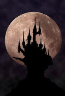
The second cover idea. It, like the first, is quiet in its presentation and selective in its color scheme. The "weeping statue" is obviously a bust of Celestia, and the idea of her weeping blood is sure to suggest numerous things about the story: death, loss, darkness, sorrow.

The third is actually one I hate, but understand its importance to. Ever wonder why every cover on every game is just a closeup on some of the characters from the game? Because it gets at least some of the point across. I mean, yeah, I like all the other covers more, but this would be the most eye-catching through being the least artistic or challenging.

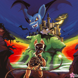
The fourth and final cover is much more based on the original cover art for the very first Castlevania title on NES, and the throwback may fly over the heads of many potential readers. This one obviously needs a rework if I'm to put it into a finished drawing: maybe make Apple Bloom smaller on the cover, and the Castle bigger.
So there's our selection. What I need is opinions. I think number three would certainly draw the biggest crowd since it's the most banal, but I kinda want one of the others...
All of them are good. Go with whichever one you feel works best.
I do like three, but for me I would say 4 imo. Its hard to justify 4 though since I like it cause I remember that cover art so much, yet there are bound to be people who have never seen it before. All in all, 3 seems to kinda be your best bet if you ask me. Whatever one you do pick, best of luck with it!
Personally, I'm more of a fan of number 2 or number 4.
Number 2 instantly draws you in with the tear of blood coming down Celestia's eye. Creating an uncomfortable feeling as you wonder what could possibly do such a thing. Perhaps a bit more to the background wouldn't be uncalled for. Not much mind you, since the image of Celestia is more than enough to draw in, but perhaps a bit of subtle imagery of what we are about to see. A scary castle in the background, maybe?
And of course, Number 4. I like it for instant recognition. I'm a sucker for tribute to the original source material. In the Incredible Flutterhulk, I managed to do the same thing with an image that is iconic for the original work. But while you worry that the original may fly over others head, they don't necessarily need to understand where it came from to feel the impact. A frightening figure looking down upon Applebloom, like she is a helpless ant. Applebloom staring up at a massive castle, the size of the thing seeming like an impassable mountain.
Those are my opinions, for what they're worth. Hope they help in some way.
My favorite is the second one. Classy as hell IMO.
nice....