
On Cover Art · 4:34am May 27th, 2022
I make all of my own cover art. Much of it is whipped up in an hour or two but most of it is also actually pretty thoughtful in design including some intriguing story details. No one ever comments on this and it's actually starting to bother me. So in my first and possibly only blog post, I'm just going to point out all of the Easter Eggs and visual concepts that people may have missed in some of my covers.
Rock, My World - The title is written in the dirt just as Boulder writes his messages in the story. His path is seen stretching off into the distance. This concept was inspired by "The Racetrack" in Death Valley where some rocks leave trails across the desert floor making it look as though they crawl around on their own.
Fluttershy Unfiltered - The cover depicts two Fluttershys, a normal one in blue and an 'evil' one in red. The red one is only visible through the bottle shape, indicating the connection between alcohol and evil Fluttershy.
Old Friends - This one is abstracted and for good reason. The background you may recognize as the pattern on Sunburst's cape but the less obvious detail is the title which at first appears to be in an ordinary pink box, the same color as Starlight Glimmer's coat. The words are red and made up of only straight lines as if the words were carved... in Starlight's leg.
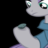
Dark Pink - At the center is changeling trapped in a Pinkie Pie colored box, the words around the changeling are are shaped to mimic bars on a cage symbolizing the main character being trapped in their roll as Pinkie Pie.
To Do List - Everything here is hinging off of the double meaning of the word 'do.' The background is a closeup of Trixie's flank which has a bunch of tally marks on it. In the story, Trixie is Big Mack's favorite mare to um... visit so it's meant to imply keeping track of something he did... a lot.
Doctor Derpy - The background is instructions for a reciprocating saw as depicted in the story. The title over it is contained in two shapes that appear to be broken apart and arranged like a compound fracture, the injury which Octavia suffers from.
Threshold - The story is about an accidental pregnancy between Sandbar and Starlight. Using just their cutie marks on the cover, I made something that looks like an egg about to be fertilized, (though the sexes are reversed.)
The Raving - The story is about being trapped under snow and slowly going insane. The setting was a rave dance party so I made the cover look like a retrowave styled party or concert flyer. The featured artists listed at the bottom are actually the content warnings, (some of which are just silly but you'd get after reading the story.) The sky in the image depicts a view of the sun shining down through a vertical shaft such as the one that Vinyl digs trying to escape her entombment.
Really makes you think, huh? Huh?
5660224
Thanks. I feel like it jumps out more whenever someone just makes an image for their story.
It’s amazing how the emotions that you experience of life can make you become so creative, I say that you deserve more credit, you should communicate with other good authors more and make your talents known.
5700206
Thank you. Before I came here and started doing fanfiction, all the stories I wrote were books from scratch, self published digitally on Amazon. The thing I like about this place is that there's an actual community that I can talk to and get feedback from which is better than what I'm used to. Spending a couple of years writing a book and then tossing it into a black abyss is kind of demoralizing. I'm probably 90% done writing the book I'm on and semi optimistic about the idea of doing a free promotion and then announcing it to my followers to see if I can actually get feedback on a book for once.