


About Face · 7:19pm Aug 5th, 2017
I've updated my icon and user page.
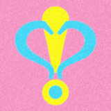
This has nothing to do with the previous post—I'd been planning this for a while now. I'm probably going to tweak the icon a little because it's kind of imperfect and only looks good at full-size (the fine fur disappears below that level).
Also, I now have a sellout Patreon page, because why not? Everypony has one! 
Actually, it's not for the money. It's just an easier way to keep track of what my fans want. I'll be moving polls and stuff there, and it will also serve as a place I can talk about nonpony works.
This will still be my primary blog for anything writing or pony-related, so you don't need to watch the Patreon page to keep track of what I do creatively or socially in this fandom.  When necessary, I'll provide links from here to there.
Note, I'll be posting soon about BronyCon. I'm planning a big room party for writers and friends, (so somepony should probably tell Titanium Dragon and Jake the Army Guy since they don't watch me).
EDIT: Should I drop the amusing "Quotes" section from my user page? I'm concerned it might potentially frighten readers away.
What quotes? The critic's quotes? Those are awesome, they're satirical, and like... yeah. Stuff.
Nice new avatar, but it'll have to be super furry to show up in small size.
TBH I didn't even know about those quotes until three months after I started reading your fics. I kinda doubt they'll have any kind of impact on readership.
...Is it a uterus? O.o
4624938
A breeding cutie mark? Fitting.
4624938
dude you wrote up my author interview you damn well better know what it is
If we're throwing in on Things The New Icon Looks Like then I'm going to have to say the NSEA Protector
4624954
Wow. Your memory is way better than mine.
So is almost everypony else's, but still.
4624948
I'm dumb.
4624970
It's okay. I probably shouldn't have put the marks so close together at the top. I was aiming to not miss the heart effect, but secretly hid the obvious from view.
I'll redo it eventually.
I was wondering about the new icon. I love it, though "Here, feel this" isn't as funny now. It kinda reminds me of the Cobra Command logo. I especially love the colors! It's like a mix between the pan and trans pride schemes. Was that what you were going for?
I don't think you'll have to worry about the quotes. I quite like them, personally
Yeah, it might drive some away and it's not going to draw any in.
4625131
I mention what it is here, though I may try to edit it a little to make this more obvious.
The colors are Pinkie Pie colors, naturally.
4625291
Oh, duh! Can't believe I didn't recognize Best Horse's colors *hangs head in shame*
Digging the new avatar! Looking forward to what you're cooking up for bronycon, of course.
Hmm, not sure about the quotes. Can't find them with the mobile version of the site (I'm on my phone). So, according to my coin flip, um, keep them?