

Sep
26th
2014
Synchrony's Cover Art · 2:35am Sep 26th, 2014
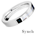
I spent a few minutes in photoshop to whack together a better looking cover art than my first attempt in Synch.
For those interested, it's here below:
I might start releasing chapters for Synchrony when my favourite (and only) pre-reader actually finishes Synch. If anyone is still interested in helping me edit or pre-read Synchrony, give me a heads up! Otherwise, stay tuned!
I originally thought Synch looked like a high-tech contact lens. Guess I was wrong.
Oh well, that still looks pretty badass!
So that's what they look like! Very nice. Chunkier than I'd imagined, somehow. You wouldn't forget you were wearing it.
2522998 Mm, what you are seeing is in fact a Synch prototype. One of the first designs before they moved to a slimmer more portable version. This image was to give an idea of what Synch looks like in general, although the current design has only two buttons and a motion sensor which is why you can start the Synch by tapping on the side of it with a finger. The blue square you see is through a window to the quantum chip they use. The blue square is an outline of the chip. The blue line on the outer ring is an indicator light.
Prepare for trouble!
Make it double!
To protect the world from devastation!
To unite all peoples within our nation!
To denounce the evils of truth and love!
To extend our reach to the stars above!
Jessie!
James!
Team Rocket, blast off at the speed of light!
Surrender now, or prepare to fight!
Meowth!
That's right!