

Pony Art · 5:31pm Nov 23rd, 2014
I posted a new story yesterday, Dusk, the sequel to Dawn. If any of you haven't checked it out yet, you should do so; it is pretty spiffy - after all, who doesn't love reading stories about ponies getting their cutie marks, or about Princess Luna as an adorable filly? Or as anything, really.
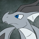
You may have noticed it has cover art you've never seen before.
Why? Because I made it.

The previous week, I drew the cover art for Dawn:

So I thought I'd talk a little bit about drawing ponies.
How hard is drawing ponies, anyway? The answer is both "hard" and "not as hard as you'd think".
The actual proportions of ponies are incredibly regular from some angles. If you look at a pony from the front, they're remarkably geometric:

Even from the side, they're fairly geometric. But things get trickier from any other angle.
The easiest part of the pony to draw is the head. Why? Because its a circle.
Seriously.

They just kind of staple things onto a circle to make it, even from the side.
Eyes, too, aren't actually that difficult; the hardest part about them is making sure that you've got the angle on the circles right for them, but you can construct them from only a few geometric shapes. That pretty eye effect - the weird angular iris thing - is done using gradients in photoshop, using an angular gradient and setting up a specific gradient to mirror what is used in the show.
Legs get trickier. As it turns out, the artists on the show are fairly lazy; sometimes, they'll draw the legs with proper joints. And sometimes...

Look at how curved their front legs are. Lazy!
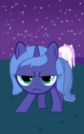
In case you're wondering, I used Applejack there as a reference for Luna, which is why the poses are so similar. Luna ended up looking a little weird, though, because she has filly proportions instead of adult proportions; as such, her head is rather larger than Applejack's, which had the very unfortunate effect of completely covering her entire body the way I had originally done it, leaving only her legs sticking out.
However, what is really hard is drawing ponies from weird angles. Particularly from rear angles. Drawing ponies from various front angles is fairly simple; they still look reasonably geometric, because they were designed to be drawn from the front and side. Once you get behind them, though, things can start getting weird.

Notice anything odd about that? No? Look at how their shoulders are all being covered up by something. Except for Rarity. Whose neck is coming out of her side.
Yes, it is remarkably difficult to find rear views of the ponies, and, well, as you can see, even the people who make the show make art errors there sometimes. This is probably part of why Celestia looks so terrible in my Dusk cover art.
The other hard part is manes, which are both not very geometric in a lot of cases and affected by pesky things like, say, gravity.
Well, sort of. Obviously there are some catches to that, and some parts of their mane appear to have remarkable anti-gravitational properties... but I digress.
Moreover, if you're actually trying to draw a pony who isn't a show pony, you need to make up a mane unless you're a dirty copycat. As manes and tails are part of what make ponies distinctive, this means that even drawing an established character at a different age can be a pain in the butt. With Luna, at least, there are a fair bit of "Luna as a filly" drawings (Princess Woona), and while they aren't that consistent, you can, at least, find a mane that you like and use it.
With Celestia as a young mare, you pretty much have to cross your fingers and hope that what you did made sense. I think she's fairly identifiable, though.
The other fun thing about manes is that, unlike most of the rest of their body, they actually get a bit of detail in that some major strands are drawn. I didn't even bother doing this with Celestia's mane, which may make it look a little weird.
Anyway! That's all that I've really got. I'm not an expert on this by any means, but I thought I'd talk about it a little bit, seeing as I'm starting to try and draw cover art. I'm not sure if I'm going to do so consistently from now on; while I've done cover art for my stuff before (almost all of my cover art is shopped) this is really the start of me actually drawing ponies. One thing I am going to try and do is cut down on production time; I spent far too long making these pieces (many, many hours) for mediocre results.
Incidentally, if you ever need to draw a starry night sky in Equestria, it is remarkably easy. I used a gradient to make the sky darker on top and brighter towards the horizon (common in the show), then simply used a brush tool with randomly sized, shaped, and placed dots to create the stars in the sky. Once I figured out how to do it, it took very little time to actually do.
Photoshop is a truly amazing tool for making art, but sometimes, it is hard to figure out how to tell Photoshop to do exactly what you want it to do. But if you can figure out how to whisper to it, it can make your life so much better.

That was a fun read. I stink at drawing ponies. Actually pretty much any animals including humans I stink at. I'll stick to writing stories and music.
2612278
The real reason Dusk's composition is poor is because of the way that I drew Luna - the original intention was for Celestia to be up higher on the hill than she was, for things to be a bit further out, but unfortunately, trying to draw it that way made it look really weird because of the way I'd drawn Luna. I should have realized it earlier than I did, but sadly, I drew Luna first.
And yes, I'm using Photoshop, though admittedly I should probably use Illustrator more for some things. And yes, the lines do look jaggedy; that is an interesting point re: automatic antialiasing and I will see if I can fiddle with the program to make it look nicer. The advice re: gradients is good and something I didn't know; I'll have to try that. Thanks for the advice!
To be fair, some parts of my hair seem to have remarkable anti-gravitational properties some days.
That, and I suspect Rarity uses enough styling product that it's impressive her mane moves at all.
2612342
Dawn's cover was entirely hand-drawn, other than the sun. Dusk was done via a combination of by hand and vectors.
Doing vector work takes more time, though there are some advantages. When I did Dawn, I used circles to set up the proportions and then drew them in by hand.
I'll have to fiddle and see if I can get them to look nicer/softer.
2612471
Yeah, going to try that next time. I actually am working on softening it, and it seems like it mostly worked for Dawn; it looks a lot less jaggedy now, at any rate.
The banding on the gradients are an export artifact; I'm going to try and fiddle with the settings to see if I can't eliminate it.
2612471
I ended up smoothing out the lines in Dawn's cover a bit via the magic of various tools (blur, feathering, and the select edge (smooth 50, contrast 40%) -> contract by one pixel -> invert -> delete trick) to make it look a lot less jaggedy, and saved as a png instead of jpg, which got rid of the banding and also saved on the file size (not that that is likely super relevant, but still). I think it looks rather better, but in the future I'll try to avoid the need in the first place.
I also redid Celestia's horn glow, which looks a lot better now. But yeah, thanks for the advice on that; I'll see if in the future I can draw with softer tools.
That's not lazy. That's just a style choice that gives movement and comfortable shape to a position that would otherwise be stiff and robotic looking. It goes along with the tapered-at-the-top shape of the legs. Art has a lot of strange techniques like that that can be used in combination for certain styles. It's cool :)
2612585
Okay, yes, I know the real reason they do it - the characters are highly iconic, which is to say, simplified, blah blah blah.
Shush.
In all fairness though, I think the joints can be used and not make the characters look weird:
allmystery.de/i/t5a17b5_laying_down_by_irishguy9001-d49347m.png
It is just probably a lot more work for the animators, whereas with the hindlegs, which tend to be more properly jointed, they don't have to do as weird of stuff with them most of the time.
2612595
Well, it's one of those things that only looks weird when you focus on it. Anything that isn't realism has stuff like that... Soooo. Yeah. ;P
I agree they could have used joints, but then the pose would have looked weird, like in that Fluttershy image you just posted. That looks weird to me because the pose is awkward even though the jointing is correct.
It's just makes for more flexible expression.
Either way, it's just a cartoon, and these are just opinions. ;)