
 Last extra one for a while.
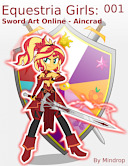
EQG:SAO Art - Hit or Miss? (Part 3) · 11:54pm Apr 7th, 2022

The last set of wingbanners came back but I need your help! One of my favorite wingbanners came from this batch. They all came out great, two are getting displayed below, except I am unsure about the two for Rainbow/Thunderborne. I am unsure if I like either, both, or neither. So tell me, hit or miss?
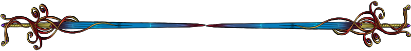
THE ART ORDER: - Targeted RBD's cutie mark colors.
Adopt: Wingbanner
Type: Decor
Primary: #A3DEF8 - THIS BLUE COLOR
Primary Gradient: #DB2D43 - THIS RED COLOR
Secondary: #A3DEF8 - SAME BLUE COLOR
Secondary Gradient: #FBF9AF - THIS YELLOW COLOR
Tertiary: #269DCE - THIS OTHER BLUE
Extra: 1st Gold #ffd700 - 2nd Blue #0d17a7
Payment: gems
GOLDEN LIGHTNING QUEEN:
BLUE LIGHTNING QUEEN:
The above is the order form I've used for every other wing banner. The gradation level is basically the same from where it starts and where it ends. I know this form very well. It's worked many times. The artist did over a hundred banners over last week alone. They know what they are doing. Both came out good, spot on for what I requested, but are either really RBD?
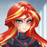
Dash is a lot harder than anyone else because of her spectrum of colors. She clashes with herself. Ignoring Rarity, everyone else has a complimentary color to their primary, with a sprinkle of other colors that still compliment. Dash's compliment is using only pastels and the sequencing of the colors. This is done both in pony form with coat/mane colors and cutie marks, as well as in the EQG clothing. Dash still is a hot mess. Hence why I focused on her cutie mark more than her mane/hair. The point of using the decor in either blue or gold was to tie her wingbanner in with the Wondercolts Guild. The same as below using the armor in the second one and others you have seen.
So, what are your thoughts?
HITS:
Fancy Wondercolt
[REDACTED]
I lke the Golden and Fancy ones the best personally
Those are both great, but I lean towards the blue. This is mostly because of her personality. I get a feeling that Dash has always been drawn to the dark hero's. Referencing her being actually tempted in the pilot with the Shadow Bolt offer and her Nightmare Night costume.
Definitely gold, the blue in the second one just gets lost due to how dark it is while gold makes a nice contrast with the rest of the banner.
Good to know people are liking them. They are a good step in the right direction. I am feeling more confident in using it for her banner. I am hoping the artist comes out with some other extras that would be instantly recognizable as a "Dash" thing. Drytil has one that is perfect for AJ and her role in the story. At the very least, I think I found the basic banner for Thunderborne that can be used with any extras.
5649328
I really do love the banners with the extra called "decor". It is refined and beautiful. For Dash, she uses a rapier and the filigree of the decor reminds me of a rapier's guard.
5649341
Dash would definitely be drawn towards of the darker heroes. I adjusted the shade of blue compared to other versions with the decor. I think it is too dark here, but it is good to know people like the blue on her banner.
5649344
Yeah, I went with a darker/stronger shade blue, trying to go that navy/gold. It worked on other banners, particularly the Wondercolt Guild themed ones, but most of the other banners use a lighter shade of blue. This shade I had never done the decor extra on and it started out strong, so there was no way to highlight it with lighter shades. These are form orders, where the artists fills it out and slaps it together. It takes time, skill, and she had to originally make the design, she does an amazing job, but I had have used this shade blue with the decor. If I had it the lighter shade, like what is on Bladescape's main banner, well the main one used in the Aincrad story, it would probably be better. I may try that shade next time. Might also reverse the secondary color and its gradient too, to hopefully draw in more of a soft yellow to create a better background for the blue.
The gold is growing on me a lot.
I like these two BLUE LIGHTNING QUEEN Fancy Wondercolt
Don't mind the caps I just copy and paste it
I’ve loved all the designs so far. They make me excited for Ruby Palace.
looks nice, also, i notice the Spiral dragon book holder banner at the top. good taste in FR dragons.
5649359
Great to hear!
5649361
I'm excited for it. Glad to hear you love these.
5649377
Thanks. Glad to know you are enjoying these. While not my favorite breed (guardians, imps, pearls), people who don't know FR could recognize those bookends as a dragon. The others I own are not as easily recognizable. I've slowly been able to get a library built, those slots go fast, and I figured it was more appropriate for my profile than the random wingbanner, and then I wanted to use it for this blog post. lol.