Story art: a workflow · 7:11am May 1st, 2018
The astute reader may notice I use a consistent design language for the artwork posted in each of my story cards. The proximate inspiration for developing it came from an editorial by Novel-Idea. I might quibble with a few of the precepts he advances—partly as a professional graphic designer and partly as a matter of personal taste—but it’s a decent take on the subject, and I recommend it as a starting point.
I had two basic objectives: legibility and consistency. Text and images had to be readable at the 128-pixel thumbnail size, even if only barely. The designs had to convey a coherent sense of common identity, but be flexible enough to allow variation from one story to another. The first goal was clear from the outset, but the second emerged only with trial and error. (I doubt anyone was pinging my stories often enough to notice at the time, but I did a lot of image-swapping as I refined the artwork.)
Workflow
The source file for each design is a six-inch-square RGB Adobe Illustrator file. Once the artwork is ready to go, it’s exported as a 300-ppi Photoshop file. In Photoshop, it’s resized to 72 ppi, which generates smoother, better-looking results than working from start to finish at low resolution. From there it’s saved out as an optimized 24-bit PNG file (with alpha transparency), which is uploaded to Fimfiction and in some cases to Deviantart.
Text
The type is simple RGB black, separated from the imagery for the sake of clarity, especially at the smaller thumbnail sizes. Title is set across the top, generally as large as will fit the design’s width. Byline is set across the bottom, no larger than the title, but otherwise as large as will fit the width. Most of the typefaces used are part of the set sold by the HP Lovecraft Historical Society, designed specifically to look like period styles distressed by imperfect mechanical printing. Those typefaces include “HPLHS” in their names, and an asterisk indicates a typeface based on an entry in the 1923 American Type Founders specimen book. (Updated to remain current, including all published stories.)
- “The Farmer in the Dell”: Roman Engraved HPLHS, based on hand-drawn letters in a 1904 sign-painters’ manual
- “Conference”: Forsythe HPLHS, based on type used in some vintage advertisements
- “Pig in a Poke”: SAA Series E Modified and SAA Series F, legit copies of typefaces used on US road signs
- “Courtesy Call”: Post Monotone HPLHS*
- Lectern’s New and Used Books: Typo Gothic HPLHS* and a dingbat from Adobe Wood Type Ornaments
- Amphorae: Lithos Pro Bold, inspired by classical Greek stone-carved lettering
- “Oops.”: Slab Serif HPLHS, based on a condensed wood typeface; many large fonts were carved from wood rather than cast in lead
- Diplomatic Overtures: Policy Gothic HPLHS, based on a typeface used in an old insurance policy
- Foreign Nationals of Unusual Importance: Telegram HPLHS, based on Western Union telegrams of the 1920s–1930s
- Mister Cook Goes to Canterlot: Extra HPLHS, based on a wood-type font used in newspaper headlines
- Virga: Blackoak Std, an extended slab-serif typeface designed by Joy Redick, available from Adobe
- Inspired by . . .: Metro HPLHS, a set of Jazz-Age typefaces spanning a range of weights and designs
- Talking Heads: Copperplate Roman HPLHS*
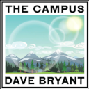
- The Campus: Times Gothic HPLHS*
Images
Most of the image elements are derived from screen stills or promotional art. A landscape is masked to size in Illustrator, while each character is cropped using Photoshop’s vector lasso tool. In either case, the image is not reduced in Photoshop. Instead, the full-resolution image is scaled in Illustrator to fit the space alotted, because it’s always best to work with the maximum resolution that’s available or feasible. This is particularly valuable for cropping; when the design is reduced for final output to PNG, any discolorations along the edges, where background colors mix with character outlines, tend to drop out.
In a few cases I was able to find a promotional image that already was cropped around the characters, or that had a white background I could use Photoshop’s magic wand on without damaging character outlines. In only a couple of places is a freeware stock image used—in one case a photograph, in the other a vector artwork—and there’s only one drawing, used with permission.
For æsthetic reasons multiple character heads in the same design are sized to match, even if the original images, or the characters themselves, are of different sizes. The number of individual design elements is minimized to reduce visual clutter and to present a clean, simple appearance with clear character silhouettes free of distracting or mismatched backgrounds.


