
Andromalius Redesign · 8:25pm Oct 20th, 2020
I've not been feeling like writing for a pretty long time, so instead I decided to draw. One of the designs I couldn't get quite right was Andromalius from my Nightmare series. Just for the sake of history, this is what I had at the beginning when I first drew him:
This is how his design was for the entirety of the first and second stories. I was learning and becoming more skillful at drawing as time progressed. And, of course, my writing also improved, and thus I decided to remake Nightmare series. With the remake, of course I had to draw Andromalius again, and this is what I made then:
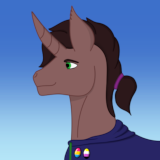
Since then, I've been tweaking and changing things. So far, I have fourteen versions of Andromalius, each progressively becoming better in my eyes. I was never quite satisfied with it and I kept coming back to it because it's one of those drawings that I really like and want to improve. So, more than a year later, the fourteenth version is made, and I finished it some minutes prior to writing this post. I think it's the closest to how I image Andromalius would look like. With my current skill level, this is what I'm able to achieve:
Obviously, I have ways to go until I achieve perfection, or the closest thing to it. That's when I'll be entirely satisfied.
Adding to the history of the character, it's obvious he was based on Hell Charger unit from Heroes of Might and Magic 5:

As some of you may be aware, I made a mod for Heroes 5 that allows you to play as Andromalius on randomly-generated maps. I have an update to that in relation to textures:
When everything is done with that particular mod, I'll update it and allow you guys to get it and play. Obviously, for now, you can use the older version I linked to.
What I have in mind is bring the in-game model/textures and what I drew as closely together as possible. I need to do that, firstly, for the sake of consistency, and secondly, because doing it will improve my skills in the related areas as well. After all, I want to be an artist doing art in all the time that I want and, you know, not die because of capitalism.
He looks good and its a good thing he doesnt look exactly like a hell charger otherwise rarity and flutershy woould faint in terror when they first met.
Beautyful art. All of em are impressive. The third looks quite creepy and the fourth on flame? Pure nightmare fuel
The star on the first design remonds me of the Orichalcos.
To be honest I prefer the first version that’s more grounded in the mlp theme.
5383361
Fair enough. I just like more realism, but yeah, I can see why people would prefer MLP show style.