


May
16th
2015
Cover art · 11:21pm May 16th, 2015
So I thought with a new act of the story, Across the Sea of Time could use some new cover art... but what do you guys think?
Keep the old art: http://i.imgur.com/igHUo46.png
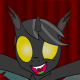
Use this new art: http://i.imgur.com/jamt2AT.png
Looks like the old cover stays folks!
I think a new act should use new art.
I think the second one is really nice but the problem is it doesn't exactly say "This fic is pony related". And the first pic kinda gives me the vibe of either scooby-do van or the other van that the guys used to sneak into the old studios of Star Wars in that movie? What was it called? The one with all those nerds and one of them had a "real" job and the others were bashing on him? The one where they had some statue of Spock I believe that the Star Wars fans knocked over? The Trekkie had something like Asthma? The Star Wars guy said he sounded like Vader or something? Dunno that movie yea.
Of course that's not entirely bad ((that the cover of the pic doesn't flat out say it's pony related)) but it helps. *shrug* I dunno brah definitely needs a change but I'm not entirely sure what change.
The new art is more fair to what the story is about than the original artwork (which while accurate initially is outdated about halfway through the story), but it lacks some of the charm the old artwork had, in my opinion.
3074578 Fair point, any tips on what might make it better?
Mix it with some D20 fanart of MLP. ... And maybe some Star Trek - MLP fanart too.
Some suggested starting points:
Dungeons And Dragons
Pathfinder
Star Trek
I mean, there is even an entire MLP official comic based around the game Oubliettes and Ogres.
2.bp.blogspot.com/-jN8iULJRi1I/Uowvd_NiSgI/AAAAAAAAANU/GUaLLU7TW98/s1600/MLP-FIM%2311+-+Oubliettes+&+Ogres+2.png
img1.wikia.nocookie.net/__cb20140627203517/mlp/images/archive/5/5e/20140627203636!Comic_issue_11_Oubliettes_and_Ogres.jpg
roundstable.com/wordpress/wp-content/uploads/2013/10/Screen-shot-2013-10-04-at-9.19.19-AM.png
I'm in the category of I like it but it doesn't really fit. What I mean by that is it does fit, quite well, to how the story is progressing. But it doesn't scream overall story either. And looking back neither does the original (but it does do a slightly better job). If I could make a suggestion, if you somehow combined the two, you would have a winner. But as it stands, I say leave the first one and make this new one the header image on the next Act.
3074745 what he said
the new art fits well, but the old art has a nice kinda charm to it
I do like the new art, but I don't think I'm "feeling it" when it comes to the story as it stands. Plus, I've always liked the art from Star Trek: The Motion Picture and the original art makes me feel nostalgic.