
 ).
).Colour Theory, Shipping and You · 10:28am Dec 12th, 2012
Or should that be colour theory, shipping and me?
Hello all, it's time for another of my not-quite-essays. This struck me as a concept earlier today when I suddenly remembered a whole series of factoids sequentially. From there it developed in my mind, much the same way as a virus initiates a hold on a host body until suddenly I hit a tipping point. Of course the tipping point never comes from within, in this case I was just reading through the comment section of the latest sadfic to climb into the feature box and I saw someone say “Twidash Forever (Dash emoticon) (Twilight Emoticon)” which really pissed me off. Not just because I don't like Twidash, I really don't like that whole stupid emoticon sign-off that entire shipping communities seem to have adapted. It's trite, boring and worst of all requires very little thought, so while I don't get as annoyed when I see the same sentiment expressed about Flutterdash, I do sigh and wish those who constantly reposted them would wake up, come up with something new and most of all, start thinking. The Appledashers are holding a contest at the moment because they're also sick of this. Things need to change, the mixture needs stirring. Well that's not going to happen, but this reminded me that this idea needed exploring so, here's something vaguely related to the absence of thought and shipping.
Colour Theory, Shipping and You
“What the hell Everhopeful? How is that a thing? Shipping is about the emotional connection between characters, colour theory is something my art teacher mentioned in the eighth grade, the two aren't related. You're crazy.”
“Am I?” The author said, adjusting a pair of non-existent glasses and abandoning the third person rhetorical discussion.
There's a quote I want to cite, but can't remember. “Let me show you... (Something or Other)”. It's probably unrelated anyway. Hear me out, then talk back.
You remember why I don't like Twidash right? I remember explaining it, and the phrase, “They looks so good together,” comes to mind as part of that explanation. Even though I'm researching this as I go, I know how this ends. I'm about to explain why Flutterdash will never be the most popular ship in the fandom.
Colour Theory
Colour theory isn't very interesting. It sounds like something designers and artists cite to impress friends at dinner parties, or when trying to prove their credentials the first day on a job but it isn't. It isn't complicated and you probably already know a good deal of it yourself through passive learning. While I'm not an expert, or in fact particularly learned in this area, it's only the basics I need to explain my case here.
There's the simple stuff. You all know what “warm” and “cool” colours are right? You've seen a colour wheel? You vaguely understand tints, tones and shades? Excellent. The one aspect of colour theory you might not understand as well, and the one I'm going to be hammering this home with, is the concept of colour harmonies.
There are a few almost sure-fire ways to create colour combinations that look good. Let me show you some of them.
Complementary Colours
The first I'll explore is the concept of complementary colours. You may have heard of the blue and orange phenomenon. This theory is the basis of that phenomenon. A complementary colour set is one that takes two colours on opposite sides of the colour wheel and puts them together to create a contrast or “popping” effect. Two colours like blue and orange. Or green and red. Or yellow and purple. Or any of the millions of other micro-distinction on the Dulux colour charts. Easy to understand, easy to apply, next.
Analogous Colour Schemes
Ever wondered why nature looks so good? This is the reason. Analogous colours schemes are schemes of roughly three similar colours. Say, the green in grass, the darker green in trees and the pale blue of the sky. When designing one, you pick one dominant colour, one supportive colour, and one colour to accent the overall composition. These compositions are seen as natural, or harmonious and thus create a feeling of happiness and calm.
Triadic Colour Schemes
These are the three way version of complementary colour schemes. Take three colours roughly 120 degrees around the circle apart, and you've got one. Very roughly speaking an example triad is purple, orange and green. You can't see the shades I'm talking about, but when (if) I have to bring this up, you'll understand perfectly.
Split-Complement
The easy mode version of complementary schemes, for when your complement just won't speak to you. Similar to a standard complementary scheme, here you take the two colours on either side of the complement on the colour wheel. If you don't understand that, don't worry.
Tetradic, or Complementary Pair
This scheme uses two pairs of complementary colours. Easy. Red, blue, gold and green is a good example.
Now we get to the point, what does this have to do with shipping?
Well...
Appledash
Let's start here.
Rainbow Dash has a blue coat, Applejack has an orange coat. If Michael Bay shipped ponies, this is what he would ship (I swear I've shown you all the poster thing by now). But wait, there's more.
Applejack's eyes are green and Dash's eyes are pink. That falls fairly close to a complementary pair again. Then there's the matter of Applejack's mane. That light blond? Falls into an easy split complement pattern, when paired with the green of Applejack's eyes and contrasted against the Blue of Dash's coat. As for Dash's mane, well that goes with everything. That's right gentlemen, as far as colour scheme is concerned, this pairing is positively vibrant. Their personalities are more similar than they are different, but when you look at them, they do look good together. Colour-wise anyway. I'm only getting warmed up.
Twidash
Let me show you the devil hidden in the details.
Take the colours of Dash's eyes and coat, Twilight's mane, the stripe in her mane, her eyes and her coat. They fall, roughly evenly spaced, all within the same 100 or so degrees on the “cool” side of the colour wheel. What do we call a run of colours like that? You guessed it, an anologous colour scheme. In this case, we have several, simultaneous harmonious colour schemes. Which creates a a very harmonious feeling.
That's right. When you look at them standing next to each other, their colours make it look peaceful and harmonious.
Pinkiedash
This one I'm going to move into the more psychological aspects of the wonderful world of perception.
At first blush, there is exactly nothing about either Pinkie Pie or Rainbow Dash's colour schemes that can be applied to any of these theoretical, canned colour-harmony creator. Rainbow Dash is blue. Pinkie pie is well, pink. Rainbow Dash has pink eyes, and Pinkie Pie has blue eyes. The two have the same contrast between their eyes and their coat as they do with each other, as has been pointed out before.
Yet this has maybe the most profound visual-psychological aspect of the lot. Blue and pink. Pink and blue. Symbols in this day and age that cut straight to one of mankind's fundamental binary systems, the social constructs of male and female. Wasn't always that way, but it's the way it is now. And together... You see where I'm going. It's got fundamental contrast and seeing them together is a fundamental harmony. Double wham. But not on the purely aesthetic level.
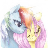
Flutterdash
After going into all that, this is the segment where I pay off. Colour theory does nothing here. I've got nothing. Yellow and Blue don't really contrast, or harmonise. They're both primary colours, but there's nothing too significant about that.
If I was going to stretch for anything and I'm about to, it's that you get the same contrast between Pinkie and Dash, again with Fluttershy's mane and Dash's coat, which is a bit more subtle in it's suggestion of the masculine/feminine dichotomy. Also Fluttershy's Mane and Coat form a roughly triadic scheme with Dash's coat. Interestingly enough, a better match for the scheme is the triad formed when viewing Dash, Pinkie and Fluttershy's coats. Maybe I should get into threes.
What you do have with Dash and Fluttershy though, is one of the fundamental harmonies. That of the sun and the sky. Or not depending on how you see colour. It's all in your head remember.
Where am I going with this?
I'm merely suggesting that perhaps, on some fundamental level, I find myself fighting an uphill battle because when you see two ponies together, the complex perceptive mechanisms in-place prefer the designs of other ships over my OTP. And that might just be the tipping point for some people. And it could be wide-spread sub-psychology or it could be nothing and I could be talking out my ass. I just don't know any more. More to the point perhaps is that I don't care. Confusion reigns, and I am just her servant.
You guys all know my whining by now, if you think of anything to add, well you know where to find me. Want me to...
Actually I'll do a few more. I'm bored, it's late. Let's go. I'll start with Rarijck. Let's see, orange, green, gold, purple, light grey and blue. Already we've got wonderful contrasts between AJ's Coat and Rarity's Eyes, as well as between as between their manes, though it's not quite as pronounced. That's tetradic, which I suppose on some subtle level makes the two of them “pop”, much the same as the conflict between their personalities does.
Twinkie presents a fantastic visual as Twilight's colours nicely harmonise with Pinkie's. Blue through indigo all the way through to raspberry pink is a long run of colour harmony.
Fluttermac has a pretty strong visual component, red, yellow and soft pink aren't quite a harmoy, but between that and the contrast between their eyes, the suggestion is there.
TwiLuna is interesting as well, with all Twilight's colours roughly in the “lavender” range, and Luna's all in the “indigo”, we get an effect here much the same as we see in Twinkie.
Twilestia is difficult at this later hour, as Celestia's colours do not easily sit in my mind. If there's anything here, it's either a split complement or a triadic.
I think I'm done just for a minute. Or maybe forever. Who knows. My reputation never existed to start with, so it can't exactly be in tatters but still...
I'll probably do another post like this at some point. Again on character design. If I can find some kind of design theory based around lines and shapes, or maybe something deeper and more elusive. Only the future knows for sure, and it won't tell me.
Til then
Everhopeful
Mm, I'm quite tired at the moment (6AM after another all-nighter) but perhaps I shall more deeply investigate this. The thing is, I feel like there is some kind of color-related attraction between light blue and yellow. Well, not attraction, but...
AHHYES. CMYK.
The same bane of my existence in Illustrator may be a color-based explanation for Flutterdash. CMYK is a subtractive color model that I have a love/hate relationship with. It stands for Cyan/Magenta/Yellow/Key, the last of which is fancy for black. Cyan and Yellow are both (for lack of a better term) primary colors in that system. Long story short I think there is some merit to this and I will have to investigate it. As soon as I can brain without being tired beyond belief!
This is a stretch.
602486
And don't I know it. Still until scientific study is done, we can't prove or disprove this kind of sub-conscious perceptual influence isn't a factor. I heard people say "But they look so good together" often enough that I decided to investigate why they were saying it and the factors involved, this just happened to be the first step. While it still might be a factor, it's important to explore it and note it and try to learn what can be done.
Or at least it's important to me.
602032
Take all the time you need, if you come up with something I missed I'm dying to know.
Makes sense. The reason Lyra and Bon Bon are canonically always with each other is because their colours look good together. I don't know how green fits into it, but there you go.