Mam Marella and the Plenn Te Affair
written by Muffin_Spectacles
This story has been marked as having adult content. Please click below to confirm you are of legal age to view adult material in your country.
Confirm
Confirm
Stats
Page generated in 0.027 seconds
Total duration
817 users online
722,657 hits today, 2,328,677 yesterday
FIMFiction
My Little Pony: Friendship is Magic Fanfiction
Designed and coded by knighty & Xaquseg - © 2011-2024
Follow & Support Us
![]() Support us
Support us
SubStar
![]() Chat!
Chat!
Discord
Follow us
Twitter
MLP: Friendship is Magic® - © 2024 Hasbro Inc.®
Fimfiction is in no way affiliated with or endorsed by Hasbro Inc.®
![]()
This kinda reminds me of that low rated movie called: Trouble in Frogtown. That, and mix that with Dune from the 1980’s.
11425901
I heard about Frogtown over the years, but never have seen it.
The more recent iteration of Dune was somewhat of an inspiration (the Turgid Kingdom’s stronghold was somewhat like the desert planet stronghold in my mind), though I do feel that this idea sprang to mind after seeing Pixar’s film Lightyear, given that it was somewhat of an homage to old-school science fiction.
The big goal os to not over-explain things, but to give the reader just enough description in order to use their imagination.
11425906
Oh, ok.
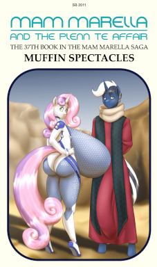
Alright, so generally speaking I don’t know if I’ll ever get around to reading this, but I wanted to say you got some stellar cover art going for you. Giving that old Scholastic style some love - at least that’s what it looks like to me.
11425972
The style was to go with the look of a 1970’s paperback science fiction story.
Went over a number of different cover styles, and then this one felt just right.
The font for the title was a happy accident, and had certain shapes that felt just right for the story.
I like some of the stories to have covers that fit with certain story styles. Like The Expansive Romance of Applebloom and Coral Lead, was meant to emulate a romance novel cover.