
The Making of: Pirene Hardcover Edition · 2:47pm May 5th, 2016
Last year I assisted with turning Through the Well of Pirene into a physical book, by doing art stuff.
After getting my copy, I thought it'd be neat to take some photos, side-by-side with the originals. Now I can prove to my followers that it really was me. and not one of my clones 

Leit's icon was the first I completed. It's a rubber eraser converted into a custom ink stamp using lino cutters. Now I can produce unlimited prints of the icon. Anywhere, whenever I want. 
Actually I produced the top one, then later didn't like how wide the oval was and quickly replicated a narrower version, which is on the bottom. Then I kept going back and forth as to which looked better. I still sometimes wonder if I made the right choice.
(Actually the book's version is slightly larger... because the original is tiny to begin with)

Daphne's icon is the Aquarius symbol written with a thick sumi brush on rice paper. I had to practice it over and over, trying to perfectly control the brush strokes. It was a learning experience, dozens of attempts until I finally got one that I really liked (bottom left of the paper). You can probably see how the others are kinda weak by comparison, and those were the recent ones. Still better than the first tries.

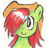
Amelia's icon was the most difficult to design, and yet required the fewest drafts. I had to keep thinking it over, rearranging it in my head. When I finally got the idea visualized, I just scribbled it down in a sketchbook, inked over it, and it was done. I think it looks better in the book, thanks to the higher quality paper.
The cover art itself was done entirely digitally, so there are no "originals" of that. I loosely sketched out the layout in SAI and directed Rachel, who did the actual painting. She credited me for helping her with the direction, but she did all the real work while I endlessly nitpicked over lighting and color balance.
I did the misty illusions on the back cover, but those were also digital. They weren't really made to be shown on their own, detached from the painting, but you can view them up-close if you want.
You may now start your bidding, for these priceless one-of-a-kind memorabilia! Just kidding. 
A billion dollars.
3921917
minimum bid is 1.5 billion, sir.
3923609 forty sextillion dollars
Oh I'm surprised I've missed this blog post!
Wow, I had no idea what process you used. That rubber-carving of Leit's symbol is pure genius.
And yes Rachel's cover is incredible.
~
You did a really fantastic job, the icons look incredible in the book.
4187497
I've been noticed!
the stamp carvings are a technique I used to do a lot. most artists can't seem to get the hang of it, because it's like working backwards with negative space. anyway, I thought the imprinting effect fit the character symbolically, like something used to be there but is missing...
hey, if you ever need more book icons in the future....