
MUSIC VIDEO #3: La Da Dee (PMV) · 7:45am Mar 30th, 2017
You've probably seen this one already. But since it's so awesome, would it hurt to watch it one more time? And if you haven't seen it, you should! 
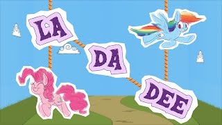
TheeLinker calls it a PMV, but it's all original animation. Even with still images of characters, he has a better sense of animation than most self-proclaimed animators.
The storyline alone is wonderful, but I think it's his attention to detail that pushes this above most fan-animations. It has a self-imposed restriction -- paper cutouts held together with strings, tape, and sticks -- and adheres to it the whole way. Even though it's digital animation, where he has the power to do whatever he wants, discipline turns it from a gimmick into a proper style.
He animates scenes by starting with the beginning problem: I have a bunch of paper and strings, how would I create this effect? By coming up with a clever solution, the pretend-paper becomes convincing. At 0:52, Fluttershy and her reflection are both part of the same card, seperated by the layer of ground in front. They can be swapped out together without being noticable. Or how about 0:48, with the paper ring of books rotating above Twilight. It would be too easy to skip past the «problem-solving» step and just have every book suspended on its own string, right?
OK, maybe those examples aren't that amazing. It gets better when combined with how he directs the more complicated scenes. 2:09 to 2:37 is great because it shows a lot of motion with just one background. Wouldn't your first impulse be to physically move Twilight's card up those stairs and back down? Instead, it's just still images connected on the same vertical strings. Change the lighting and now it's a different time. The same strings used to bounce Pinkie Pie also control Fluttershy. A scene with six different characters only required five strings, with only two of them physically moving.
That's cool because it's economical with imaginary resources, but let's add in camera movement. 0:25 shows the same scene from four different perspectives, but without any cuts. It features some great directing: I love how the top of the balloon appears before it's shown from the side, before we actually know what it is, or that a balloon is even present. The scrolling background is doing almost all of the motion, and the scene is continuous because of the rotating camera. Now the strings can dangle from the side or bottom, respecting gravity. It doesn't make sense realistically (why would a spectator be watching this upside down?) but logically it fits without breaking the illusion. This is used again at 1:17 to show two parallel scenes going on at the same time, each pointed in a different direction. It's an artificial camera trick, but did you consciously question it?
It took me several viewings to realize that at 0:43 Pinkie Pie is breaking the fourth wall by acknowledging she's suspended by strings. It's cute because it's subtle. And Pinkie's checklist at 1:35 is almost an animation within the animation. There's so many great moments, and they're only possible because it embraces this animation method, rather than using it as a shortcut to get to the end goal.
And of course, the finale at 2:41 is glorious. It set up all these rules and then breaks them.... but not really. It's still using paper, strings, popsicle sticks, just now in a 3D environment. It's like it's saying, "hah, we never said 2D environments only. You assumed that rule on your own."  It fits as a surprising reveal, breaking out of the boundaries. And it's so emotionally uplifting and magical because TheeLinker could've done this anytime, but chose not to use this impressive 3D style until it really mattered.
It really is harder than it looks. Sure it has some minor flaws, but all these strengths I pointed out go above and beyond what I was expecting. The danger in art isn't making mistakes, but not-thinking and working on auto-pilot. You'll produce something generic and safe, that looks the same as what everyone else is doing.
It's, uh, more memorable than the Paper Derpy series.

Besides the drawing style, it doesn't even remind me that much of Paper Mario games. The backgrounds and effects are more of a standard MLP fan-animation setup than a world made out of paper. The flat character flip is more of a cheap shortcut for making flash animation with less work (it's already flat to begin with).
It's just a gimmick.
I don't mean to be too harsh, comparing it to La Dee Da. To be fair, it's still better than Mentally Advanced's generic newgrounds animation style. 
Better than that, even - the sequence from 1:51 to 2:08 is also done with a 3D... uh, setting-thing, but subtly enough that someone expecting more 2D backdrops might not notice. (I didn't realize it myself until rewatching.) It's most visible in the Crystal Empire bit, since there's no foreground stuff to track too; watch the branch of the snowflake closest to the camera.
Also, I love the little bit at 1:02 where Scootaloo's picture falls off the string and Sweetie uses her magic to reattach it. Pehaps Scootaloo had a point when she complained the tape wasn't ideal.
4477047
oh yeah, that's true. it's made to look like a diorama. so it's technically 3D too, but from a fixed perspective instead of free-roaming.
I just couldn't think of a simpler way of explaining how the last scene is totally different from the rest so I just said "3D"
I found this recently myself and loved it.