
Mar
14th
2013
Designing a flag · 7:01pm Mar 14th, 2013
So I thinking about the next project I am planning and I thought about what sort of flag would humans use? So I went on and started to work on one.
The first one is pretty simply: Party colors with Party symbols. However, I decided to scrap this because... well, it's kinda too totalitarian. Same goes for the Version 2, where I was using Earth.


So, I rethought my approach. What symbols would human nation use? Green for earth, blue for sky and black for space. So I got this, with upper black bar for space, middle blue for the sky and green lower bar for the ground they have reclaimed

However, it is kinda bland. I decided to pimp it with ideas from the old desing:

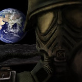
And finally, alternative version where Earth is replaced with the current planet:

Report
Scorched Earth · 305 views
·
Red probably isn't the best color.
It also could use a bit less contrast...what am I doing.
918814
Still tweaking it around, those I should note that red/yellow are The Party colors are pretty common among humanity. Still, you are right in that contrast is little but too high.
Flag must be simple, yet distinguishable. It also should not have small details, as they are hard to notice from big distance. So, the pure three-colour is the best here.
920155
There are plenty of real life flags with way too much details in. Still, as long as the basic design (In this case, black-blue-green) is recognizable and unique, little details do not matter.
Though I am thinking of using three-bar flag as civilian flag and the last flag as state flag.