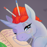

How to Get Featured Better · 2:30am Mar 16th, 2019
One of the most difficult parts of getting a story on FimFiction comes after actually writing it. You publish a story and it sits there, not getting any views or attention. You've poured your soul onto the page and no one has come along to look at it.
Why? And what can we do to fix that?
To preface this, I'm going to be very frank about a lot of things. This isn't going to just be about how to increase views on your stories, though hopefully that will be a side effect. I can't promise that you'll suddenly get horse fame, but I can promise that these tips will at least help you get a fair shake at attracting some readers.
First of all, you judge a book by its cover.
I know what you're gonna say. You've been told over and over again not to do that. You're supposed to give a story a chance and let it stand on its own merits. If you're an author you might be offended by the idea that people are gonna judge your work before they've seen even one word.
Tough. They're going to judge it.
In the real world, when you walk through a bookstore you don't sit there and try out every book on the shelves. You find me someone who says they've gone to Barnes and Nobles and- wait, are they even still open? The point is, when you go shopping for books (or cereal, or soda, or anything else) the most valuable thing is your first impression. Your cover image and your short description are that impression.
There are three big things you need to worry about, and we're gonna tackle them one after another.
SHORT DESCRIPTION
Number one, we've got the short description. Guess what? This is maybe the most important part. You need to reel people in if you want them to actually click into your story and this is the bait you use. A good cover (and we'll get to that) gives you a lot of flash, but if you've got a bad short description they're just gonna take one look and walk away.
So what makes a good short description? You tell them about the story! Yeah, it's a little like a teaser trailer where you just have to intrigue people, but if you want them invested, you gotta give them something to nibble on.
My honest advice here is you figure out two facts. The main character and the main conflict. Then you mention both of them. If you have an AU, you'll want to consider mentioning just why it's an AU either here or in your long description. You don't have to be super specific. Go for the feel more than the fact.
Let me shoot you an example, right? I'm just gonna go ahead and pop open my list of favorites and grab a few good short descriptions. You already have my thumbs up on these, and you can assume they've got my seal of approval, whatever that's worth.


LONG DESCRIPTION
Alright, so you've managed to get someone to click into your story. They're looking at the long description. You haven't won yet, hotshot, but you're a lot closer to sealing the deal.
A good long description should echo what you have in the short description and expand on it. Seems like common sense, right? Here's the logic behind it - if you've got a good hook to draw readers into your story, this isn't the place for it! You need that hook in the short description. This isn't to catch the eye and attention, this is to ensure people are going to start reading.
If you have content warnings, drop them in here. I don't mean just for clop fics - though they need the list more than most.
COVER ART
Yeah, we're going there.
I get it. You're not an artist. I'm not an artist either! I can just about manage to collage something together to make a decent cover, but you don't have to go to that much effort. If there's a nice piece of art that fits your story, you're a heck of a lot better off using that art (with permission, and a link to the source) than having a story with no cover at all.
That said? I got a few solid tips.
Uno: You want your cover to read well at small size. Sure, they get blown up bigger in the feature box, but if you wanna get there in the first place your cover has to look good when it's sitting in the new stories column with everything shrunk down to the size of a postage stamp. If you kids don't know what a postage stamp is, it's what we used to use to send an archaic version of email known as 'regular mail'. If your cover art is a pencil sketch it's gonna look like a blank white sheet when shunk down that far, and if it's too complicated with overlapping characters and lots of detail, it can look like a mess.
Two: Get it in a good aspect ratio. Think of a book cover or a movie poster. You want something in portrait, though the exact ratio and dimensions don't matter. Me? I usually go for A4/A5, which is basically standard letter paper ratio. Like I said, you don't have to be pedantic about this. If you've got a good image that's a little more square or more narrow, go for it.
C: Put the title on there! Even if you're just using a vector slapped onto a background, putting the title on the image will make it look a dozen times better. If you put some effort into it and make the name look a little nicer with some good font work and typesetting, make it a baker's dozen. I highly recommend looking at some professional movie posters and book jackets for ideas on composition.
Delta: No porn. Trust me, the mods nip that in the bud dang fast.
TAGS
Oh man, you thought I only had three tips, but I actually have four! Secret final boss, baby! Now you might think tags are just descriptive, and that's true, but that doesn't mean you shouldn't think about them. I ain't gonna tell you you gotta write a certain type of story to be popular or that you should lie in your tags. Definitely don't do the lying thing.
That said, I just wanna give you fair warning that there are some tags that are definitely gonna get you hate, and there ain't nothin' you can do about it. First off, the 'edgy' tags like Dark and Gore. Not your fault, but there's a general feeling that some authors don't know how to handle mature themes well and just throw around gore and death for shock value.
Second, human and crossover. They're sort of in the same boat. Some people like peanut butter in their chocolate, some people are allergic and will literally die. You write a story with one of those, people are gonna let you know how Displaced or Anon or HiE is the worst thing since that time the world ended in 2012. It's a matter of taste, but something people feel strongly about.
Lastly we have the rating. Honestly, try to get the rating as low as you can. If you're writing a clopfic, well, you can't avoid the M rating. If you're writing something else, see if you can aim for a T or even E. Sometimes it's only one scene that's bumping the rating up and you might want to think about working around it. You might ask why this matters. Answer - some people have Mature stories hidden. That's a whole lot of people not seeing your story at all!
Anyway, before we finish, let's look at the new stories column as I write this and see what we've got there.

This list is your first chance to get someone's attention. Forget the featured box or popular fics, this is how you get heat for your story in the first place. I'm pretty lucky here because these five stories are actually good examples to use.
If you're reading this and one of these stories is yours, know I'm leaving an upvote on all of you for being good little test subjects.
Ashes of a Demon is the first story and it has one very strong point - it has a great cover picture! It's a good aspect ratio and the image is clear even at a small size. Unfortunately, the short description doesn't tell us what to expect and has some grammar issues.
Beyond Hypothermia has a much better short description. Between the title and the description, we have a fairly good idea of what the story is about. Unfortunately, it doesn't draw the eye. A lack of any kind of image is a bad thing. The cover image lets readers see you at a glance. Couldn't leave this guy a thumbs up because he has ratings disabled, but let's all pretend he's sitting at +1.
A Typical Day Of Crusading has a great short description too! It also has an image, which is good, but the image itself isn't great. It's a cropped image from the show, which isn't the worst way to go, but we can do better. It would be great if the aspect ratio was closer to a portrait. It still reads fairly well at small size, though. If you don't have a lot of artistic talent or time to find the perfect derpiborru image, it's not bad at all.
Learning to Live Again has a very strong short description. It describes the story succinctly and tells you exactly what to expect. Here we have the first custom cover image, with a good aspect ratio and the title included. Great effort! The one issue is that it doesn't read well at the small size you get in the new stories list. I expect this will get a good number of views.
SCP-5049 oof. owch. my bones. This isn't good. First, this should probably be tagged as a crossover, but putting that aside, the description tells us nothing about the story. If you weren't familiar with the Foundation you'd have no idea what this was about. If you really wanted to put a skip on FimFiction, I'd suggest putting the item's description in the short description. No picture used when you could have tossed on an image of the Foundation logo or the item. Honestly I'm surprised this has the views it does. Because I was morbidly curious I glanced at the long description - it's basically the same as the short description, which is to say 'nothing'. Don't be like this, dear reader. Actually describe your work. I wouldn't be surprised if this story was reported or removed.
The short description also helps if you can get the "Pow!" in the first few words. Let me pick on one: The Quiet Equestrian (which I like also)
Original: An ill-conceived royal decree causes months of wacky demesne-related antics for Twilight Sparkle. Then it triggers a civil war between the Noble Houses of Equestria. Things get markedly less wacky.
Variants that bring the impact closer to the front: Twilight Sparkle did not mean to start a civil war. etc, etc, etc.. the rest of the description
(slightly less 'to the front' variant): Doctor Princess Twilight Sparkle has begun to find several new quirks that go along with gaining wings. For starters, she now owns a relatively small area of land, some Not-So-Royal-Guards, a few criminals that need some of her guidance, and an upcoming civil war. Thankfully, she has it all in control. Except for the war. And the criminals. And... everything else.
ghghghghghggh
One of the most sure-fire ways I've ever found to get stories in the box is to have a single controversial aspect in the story that people will make lots of comments about very quickly. I'm not being facetious either, that will shoot stories up the rankings like crazy. They'll probably leave just as fast, but hey, if your whole goal is to get featured...
I've never been convinced of the benefit of including the story's title on the cover picture, and the stories you look at include a perfect example of why:
cdn-img.fimfiction.net/story/ejjl-1552399446-433870-tiny
You can't see jack. At listing size, that title is just a smudge. It fills up space, which takes away the visual effect of the picture itself, while not adding anything. If your title is really short - like one short word - you can maybe make it work, but most stories don't have that. It's not the fault of the particular author - he had a nice big title, didn't use a freaky font or ugly colours or anything.
In contrast, the first story in the list has a much better cover picture, with a clearly recognisable Sunset Shimmer filling the frame. Squeezing a title in there somewhere would only detract from it.
So what do you see as the benefit of putting the title on there, when it comes at such a cost?
This is a good blog. Almost all of this is really good advice, even for the seasoned writer.
However, I'm going to agree with 5028896 regarding the title's presence on the cover image. It looks great when it's featured, but, as you say yourself, it can be hard to read words at the scale of the New Stories list. One exception: single word titles.
And speaking of titles, that's another good way to get clicks (though generally comedy stories benefit the most, from what I've seen).
One thing I'd add: for both the short and long descriptions, please, please, make sure you don't have typos! Spelling mistakes, punctuation, or just generally bad English in the descriptions are an instant turn-off. Maybe some people don't care as much as I do, but a fair chunk of the audience are going to see a mistake in your description and assume that story will be even worse.
Ashes of a Demon also uses a cover art that was used by another fic. People that might think that's some sort of update will definitely be upset by that.
5028947
I recently (pbft) ran into that problem with my Orofic. I needed a cover for Sunset Shimmer that wasn't too explicit considering the subject matter of the fic, so I just grabbed the most recent picture that was inoffensive and generic enough to work. I was later told someone else had a fic with that same cover art, and I just went "ooops."
5028896
5028933
You're absolutely right that slapping the title on an image in MS Paint isn't going to win you many points. The big thing is that an image that has been edited specifically for the story means the author at least put in that tiny amount of effort instead of googling 'sad horses in snow' and linking to the first result.
5029305
Ah, I see what you're saying. That's a good point.
Gotta google 'happy horses in snow,' instead.
Nice advice.
Huh, I didn't know my story was mentioned. I thank you for that. I did delete it though. I won't get into the reason why but thanks for this.