
“In which Spike …” now with cover art. · 12:07pm Oct 2nd, 2018
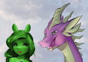
I admit that only creating the cover art when appraising the pony in its finished state (which is supposed to be Rising Up) who is looking so deliciously uncomfortable, i could empathise with the awkwardness of this interspecies relationship. She really looks like she is thinking: “He's nice and all, but … he is a freakin' dragon!” while Spike just goes on rambling: “And then Fluttershy just stared down that cockatrice! It was so awesome!”
That was what ultimately convinced me that this probably was the appropriate cover art for this story.
I considered making Spike even a little bit larger to emphasize the species differences, but i'm imagining them sitting together, so standing he'd be more than a head taller than her, which should be plenty enough.
Decided to give the entire thing a green hue rather than sepia, because 1.) Rising Up's primary colour is green and 2.) everyone has done sepia.
On a different note: i wish people who downvote would leave a comment on why. I don't mind getting downvoted, really – i think i might be the one most painfully aware of this story's shortfallings, and i do expect that some people downvote more out of personal preference than for objective criteria, and you cannot please everyone. But … why downvote if you don't tell the creator why you dislike what he offered? You cannot expect people to by mere chance figure out what you disliked and then create something better suited to your tastes, right? What is the purpose if you do not make the reasons for your dissatisfaction known?