

The Young Filly and the Sea - Concept Cover Art · 4:53am Jun 14th, 2014
I've spent a few minutes with Inkscape and Paint to pop out a few prospective cover arts for The Young Filly and the Sea, so if you want to take a minute and look at them to tell me which one you like best, I'll start getting everything put together and maybe get the story published early next week.
First is the cover modified from the Hemingway book, The Old Man and the Sea which was the basis for the title. I'm not sure how many people will get the reference, but I thought it was worth the effort. (with fading and all caps)
Second we have a common beach scene that we are all familiar with, packed in like sardines and frying in the sun. I had "Sea" fade out at the end to imply some sort of mystic fading away, but I can put that back if needed. Tell me if it looks funky. It seems a little dark after editing. (with fading and all caps)

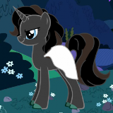
The third one is more Friendship is Magic themed, with several vectors and a more colorful appearance. (now with all caps and fading)

The vectors are all from DeviantArt, and will be credited as:
Filly Twilight Sparkle by zomgmad
Good Pace by SilverVectors
Derpy Hooves Flying by SierraEx
Princess of the Beach by dm29
Beach Backgrounds Clipart from 3906 HD Wallpapers
So, what do you think?
First pick it top, second is bottom.
AFter having read the docs I rather like the final one. WIth the second one in um, second.
I preferred the first one from an aesthetic viewpoint, but the bottom one told me much more about the story (for reference, I have read 'The Old Man and the Sea' but not with that cover).
I think the fade-out effect in the second pic would work better if it was along the vertical axis instead, in order to match the ocean better.
The last pic is definitely the weakest; if you want to go the highly-expository-vectors route, I think it would work better with no title in the image itself and the overall scene tightened up. As it is it feels like the simple style is at odds with the depth and breadth of the scene.
Overall I like the first one best (although the second is good too and may match the story better for those who don't get the reference), but I can't quite get comfortable with the font in any of them. Have you tried applying the same "fuzz" effect to the title in the first pic that is on your name? I think it helps the text match the art style. And what do all of the pics look like with text in all caps? Cover art doesn't necessarily follow the same capitalization rules as normal text, any more than conventionally-capitalized comics dialogue; a quick random sampling of paperbacks in my room shows only one example of a mixed-case title on the cover, and it's in a pseudo-cursive font.
(Full disclosure: haven't read "The Old Man and the Sea" nor the Gdocs version of this story; also not sure why I'm pouring so much thought into what I understand to be an entry into a kind of jokey contest. But hopefully I mentioned something worth considering anyway.)
First feels totally disconnected from the story.
I like the middle one best.
The last one is not bad and gets my second place vote
I'm going to go second, then first, then third. The aerial beach view and fade effect are nice, as is the classic cover. I've never been a big fan of vector collages, even ones involving best pony.
The fade-out is a solid idea, but imo it fades out too fast and too far; maybe try fading the whole line out, and only going to 40% transparency, or something like that.
Needs more comic sans.
2205816
2205839
2205850
2205870
2205884
2206116
2206408
2206763 Checked the 'Caps' rule, and you're almost perfectly correct. Only two books at hand that did not follow it were "A Short Victorious War" and "A Farce to Be Reckoned With" (yes, I have eclectic reading habits). Fixed. There is now a gradient fade on the bottom as suggested, but did NOT use Comic Sans for fear of thousands of graphic artists hate mail. (seriously, they hate that for some reason) Used Century Schoolbook as a typeface for the most part because it's hard to go wrong with that. The fade was tricky. If you make it fade so it looks right full-size, it just vanishes at the small size so you have more of a "The Young Filly and "
The wife says she likes the third one, which is the first positive pony comment I've gotten in two years, so maybe there's hope
I like the first two! The first has is a very nice callback to old covers, but I really do like the fadeout and beach in the second.
However, as far as being cover art for a story... I wonder if the last would work better, since it shows the characters large and makes them the focal point of the art.
One suggestion I'd make would be a change of font- a block font or something like Georgian (ha!) might work better than the one you chose, though that's just my personal opinion.
I like the first one best, but the third is going to be your best bet to be read by anyone other than us.