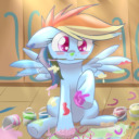
Art for Fanfiction
5,183 members · 214 stories
Join our SubscribeStar to remove these adverts!
Stats
Page generated in 0.012 seconds
Total duration
709 users online
662,725 hits today, 2,237,019 yesterday
FIMFiction
My Little Pony: Friendship is Magic Fanfiction
Designed and coded by knighty & Xaquseg - © 2011-2024
Follow & Support Us
![]() Support us
Support us
SubStar
![]() Chat!
Chat!
Discord
Follow us
Twitter
MLP: Friendship is Magic® - © 2024 Hasbro Inc.®
Fimfiction is in no way affiliated with or endorsed by Hasbro Inc.®
Hi there! It's time for me to announce the results of the art contest, now I've had some time to sit down and think about the entries (it's been a busy couple of days). I've also included a bit about my thought process as to why I selected these entries; apologies if it sounds a little pompous and art-teachery, but that's just the sort of man I am.
To all, cheers for entering! There was not a single disappointing entry, so I'm very glad to have ran the contest, and I hope everyone had a good time entering.
Main Category: Entry by Cyonix
For the main image, I feel like this image represents the idea of a group dedicated to mixing art and fanfiction the most; the depiction of colouring in covers to books, especially brings to mind providing art covers and illustrations, and the focus of the piece is dedicated to that process, showing it in a creative and very MLP-ish way. The piece itself is also among the more detailed of entries, with crisp, detailed, and colourful backgrounds, defined yet blended shading, line thickness and colour variations in the lineart, and clean anatomy and posing; examples of the kind of digital art techniques I think many of us come to expect when we look at digital art, making it a great ambassador image for a group that (primarily) deals in digital art.
Rules Category: ZettaiDullahan
I promise I'm not too biased; I feel this piece, more than the others, gets across a flash of seriousness that the rules category inherently carries, albeit in a somewhat cartoonish and silly way so as not to take itself too seriously. Whilst this may sound a little self-congratulatory, I do also think it's good to have a piece that depicts an active user on the site, which I think will tie it well to the current active community. This was a concept that I think the artist also went for with their ill-fated (but nonetheless impressive) Talent Listings entry, and I think it's a good angle to go for.
Forum Category: Uz Naimat
I think I had the hardest time picking the forum category piece; in the end I went with this one due to the relaxed air I think it carries; a depiction of a quiet space with soft, pastel-like colours (enhanced I feel by the lack of lines, which makes it look softer and almost more 'fuzzy' to me without being blurry) where discussion and collaboration can take place, but also one that is waiting to be filled. I think the empty chairs beckon users to enter the space, which (to me at least) makes it seem more inviting, which is why I leaned towards it.
As the day passes you will see the entries replace the broken image links on the main page; I encourage ye all to go and check it out as they get filled in. To the artists of the winning entries, I'll also be sending you PM's to discuss the prize money. See youse soon!
That pic gives me pagemaster vibes of nostalgia.🙂