Nightmare Moon Is The Best Pony
1,935 members · 783 stories
Join our SubscribeStar to remove these adverts!
Stats
Page generated in 0.013 seconds
Total duration
983 users online
165,699 hits today, 1,943,222 yesterday
FIMFiction
My Little Pony: Friendship is Magic Fanfiction
Designed and coded by knighty & Xaquseg - © 2011-2024
Follow & Support Us
![]() Support us
Support us
SubStar
![]() Chat!
Chat!
Discord
Follow us
Twitter
MLP: Friendship is Magic® - © 2024 Hasbro Inc.®
Fimfiction is in no way affiliated with or endorsed by Hasbro Inc.®
Okay, a few disclaimers before we begin. These changes are due to my personal opinion and experience in character design and drawing in general. If you don’t agree with some of my changes, well, that’s totally fine. Tell me what you liked and tell me what you didn’t like! :)
Now, lets dive in!
Okay, I don’t believe that Nightmare Moon’s color palette needs much changing. However, I wanted to see what I I would have done personally if I were Designing Nightmare Moon. The final re-design won’t have the changed palette. (Unless you guys want me to make one with the altered colors, lol... Tell me what you think of the color change, I honestly want to know what you think.)
Also, I‘m keeping the these concepts in the traditional flash style we are familiar with. I wanted to make sure that these changes could actually work in the flash style and look good. I want to provide solutions that could actually work for the show.
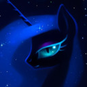
This pic (on the left) is when I actually did do several serious design changes. I gave Nightmare Moon a serious face lift. I gave her a larger snout so it doesn’t look weird and scrunched. I also fixed the uncanny eye problem!
Another one of the bigger problems I altered was this poor girls overly circular head. I gave NM small helmet horns to accentuate her ears to make them fit in better. The helmet horns are also there to help the viewer get a point of reference when NM’s head would be animated to rotate. Oh, I also removed the nose point!
I changed NM‘s hair so it seemed more real. I also wanted her hair look more regal. She’s a princess. Wait... strike that. She's the queen! The empress, even! The original design‘s helmet and hair was just not very regal. (In my opinion)
I wanted to show you guys that with this design, Nightmare Moon can actually look pretty okay front view! If you can get a good side and front view, you can definitely get a good 3 quarter view too!
Now, I also did the color palette change for the altered version too. (It’s really growing on me, but it’s too extreme of a change)
So! There it is... comments? What did I miss?
Okay, Now that I have re-designed Nightmare Moon in the Flash style... You know what comes next... Nightmare Moon re-imagined in my style
Only thing I don’t like is the larger snout.
7317170
In the flash style, I liked the colour palette change for the hair. I think it opens up the opportunity for more colour changes to make Nightmare Moon's hair actually look like the night sky (with nebulas and so on). I don't think the colour change needs to extend to the Cutie Mark, however. Or at least the lighter teal-ish colour doesn't match with the body colour.
Additionally, I liked the helmet changes, though not the head shape changes. The smaller snout accentuates elegance, which Nightmare Moon should have in my opinion because she is the rightful royal heir to Equestria. The original eyes seem more appealing to me because of their sharper angle (or whatever, I don't know how else to describe it). Lastly, the hair looks good in both the reimagined and flash styles. However, I prefer the original look because of the unrealism. I think it conveys power beyond the comprehension of normal mortal hair.
I like the more hair like mane and the redesigned helmet. Just my personal opinion but maybe you can add a lock of greenish hair to her (like in the second to last picture but instead of everything being green, just a single lock). Overall a good redesign
Never actually liked Nightmare's tiny snout, so it's good change in my opinion. About helmet, armor around horn base is good idea, as it would make whole more stable, but I don't know what to think about these "razors". Rest of face change look off, but it's only due to being accustomed to her normal look.
Great work.
It largely looks good but I think you overdid the snout a bit.
Or underdid the helmet a bit.
The point of that part of the helmet is to guard her snout. That's its function. To have it stop at right angles with her snout makes it not only fail to serve its function, but makes it seem like her face changes shape on a 90 degree angle.
Obvious we must compromise for style, but my suggestion would have it go part way along her nose, or at least intersect her nose at a less extreme angle.