
 cks you designed to be ~exotic~ or whatever, and those rabid jerks at Disney can only grit their teeth now!
Through the Well of Pirene, Supplemental — My Thoughts · 2:43pm Apr 27th, 2016
After the last time, I was approached by the author, Ether Echoes, and very politely asked to at least read the whole story before slamming it so hard.
And fine, I belive that is the type of manners and patience are things that should be rewarded, so I tried.
Oh god, how I tried. 
But considering that was over six months ago, I believe you can guess how it went. 
I'm sorry, I got to and including chapter #21 this time, but every time I look at those unread last tabs I just... Feel angry and annoyed.
Wall of text where I went my frustrations behind the cut. Spoiler warning.
I just... don't care the slightest for any of these people. Or goblins. Or ponies. It's just such a never-ending parade of ass-hats you stop caring who is flinging muck at who for what reason. it just becomes this stinking sea of brown you don't want to get involved with.
The fey are worn-down and dejected outcasts with the intimidation-factor of house-cats. And so fatalistic and petty at that, that I just want to reach in through the screen and smack them all with a bit of iron rebar to give them something to actually complain about.
The ponies... are set-dressing. They do diddly squat that some hidden elf-village couldn't have done. They even frequently stand around doing zip during combat as to not distract from the protagonists 'awesome.'
And everything is humanities fault. Intrinsically, because since we're such mundane, boring meanies, we somehow killed all the joy and wonder in the world because there was one ass-hat during the time of wonders.
Oh, right, and everything was somehow hunky-doray in 'ages long past~', because of reasons. And the main characters get some fucking ichor (read: blood of the gods) because of... other reasons.
Nobody earns anything in this story. Not victory, not their powers. It just... happens, because the plot AKA destiny says so. And they never, ever have any problem controlling those same powers for the same reason.
Again, I cannot recommend this story. It banks far, far too heavily on inspiring a sense of wonder in the reader that it's the only thing it really has going for it. Nothing about how stuff works is explained, it's just... magic, destiny, and horrible people being horrible at each other.
And if you've seen goblins, faeries, read some Greek myths? That's not happening because this story plays those elements so kid friendly they don't have any sting left. It's like trying to take the robots in the German version of Half-Life seriously after you've seen the spec-ops guys in the regular version.
Take the actual myth of the girdle, for example. WoP seems utterly uninterested in that in those original myths, Paris was punished for his hubris. That pegasus lived on to become a constellation, (a rare honor according to the Greek) while his 'master' plunged to his death. It's just... glossed over without as much as a lampshade-hanging.
Again, though, I'll say this: If you are unfamiliar with fairy lore and Greek myth, you might actually enjoy this. The language is quite evocative, and there's this scene earlier I'd missed last time with a goblin market so good it actually drew me into the story for a bit.
But it's just... I've seen all of this before, done better, and the only thing unique about this is that it had a pony on the cover. Now replaced with a well-drawn but boring woman pouring water on grass, of all things.
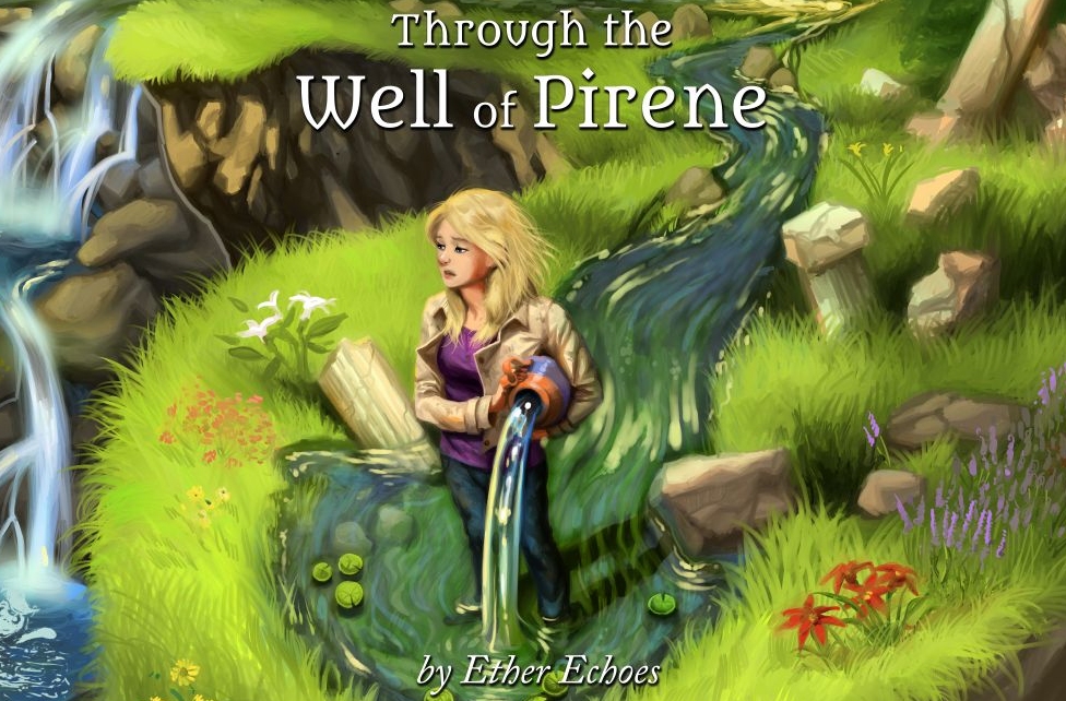
Oh no. She's... over-watering the lawn while watching the horizon! The epicness! Ahhhhhhhhh~!

Jokes aside, I think that is the thing I find most aggravating about all this. What's-Her-Face could have just as easily become, say, a classical unicorn, and it would have had just as much impact on the plot as the pony stuff. Even Celestia spends her entire (to #22 at least, to be fair) on-screen appearance mute and bound, and could have just as easily been replaced with the actual Pegasus for all of how recognizable she is as Celestia.
It really makes it feel as if this was meant as a fantasy novel first, with ponies sprinkled atop as to be publishable on this site and earn an relative easy audience. But with not too much ponies so it would be easy to switch them out for something less copyright infringing once it was time for publication.
Take Lyra for example. She does nothing for 90% of the book I read except stand in the background and make 'wacky' comments, but she's still listed as a main-character. What's-Her-Face doesn't even consider her a friend. What's-Her-Face's child-hood friend doesn't seem to consider Lyra a friend, but an annoyance. For all intents and purposes as far as impact on the story goes, Lyra might as well have been novelty wall-paper enchanted to speak.
And that scummy feeling, right or not, just rubs me the wrong way. Destroying what little enjoyment I had left.
Again, mad, mad props to Ether Echoes for keeping her cool against such a scathing review, but this story just simply isn't for me.
I think she will write great things one day—quite possibly even make it professionally, but WoP is simply so full of assholes, idiots and unimportant by-standards that it just leaves me feeling apathetic about their struggles.
I said it last time, and I'll finish up by saying it again:
So yeah, if Mr/s. Ether Echoes ever figure out how to actually give his/her character's some positive traits I believe s/he might be a force of writing to be reckoned with but this particular story fell rather short in my opinion.
Thanks for reading, and a personal sorry to Ether Echoes as well. I tried and I deeply respect how politely you took critique last time, but WoP just rubs me so the wrong way it might as well be with a belt-sander.

Savage.
But having made an attempt to read this "back in the day" You made it farther than me, I apparently made it to 6 which might make this the first fic I abandoned.
Your review started to sound like it was reaching for something to complain about at the end.
Okay, you don't like it. You found it unengaging, and that's your opinion. But complaining about how boring you find the cover art goes from critiquing to whining in two seconds flat. Especially since that cover art is actually well drawn.
If you're going to review something, only mention the meaningful parts (such as finding it engaging, or not as the case may be). Don't add unnecessary length on pointless bits that make it seem less like a coherent review and more like an irrational grudge.
3900206
Yeah...
I try to to hold it back to be fairer and more constructive, but growing up the eldest of four brothers and a sister is one of those things that puts razors on your tongue.
I do hope it came across that my gripe is with WoP itself, not its author, though.
3900227
I strongly disagree with this.
The old chest-nut about books and covers aside, the new cover is boring and not enticing in the slightest. It's a woman dressed casually holding a magic pot. Whoopee.
(Although I will admit, on a technical level it is very well drawn, that doesn't stop the subject-matter from being boring.)
Compare and contrast with the old one:
derpicdn.net/img/view/2013/3/2/259819__safe_oc_fanfic_transformation_human+to+pony_artist-colon-kuda_through+the+well+of+pirene.jpeg
Now that? That actually made me start reading WoP in the first place. Who's the girl? What happened to her? She's clearly an ex-human from those clothes, but what does the water have to do with anything? And just look at those pin-pricks! This looks actually really interesting!
...And then I actually read it. But the old cover's damn good.
The cover is the first glimpse you get of the story as a whole, and it can often influence you as a reader before you've even cracked the book open or as much as read the synopsis.
Heck, do you know what book I bought on impulse once, because it was cheap and had an awesome cover?
cdn.bleedingcool.net/wp-content/uploads/2015/08/Dresden2.jpg
That's right, Stormfront by Jim Butcher.
I wasn't even that into urban fantasy at the time since I felt that Buffy had mined the well dry, but it was about fifty SEK and I felt curious.
That was sixteen books or so, several hundred thousand words worth of fan-fiction and roughly half my followers doing so because of those two stories ago. One of the first fan-fictions I ever started hacking away at was even Dresden related, so if it wasn't for that cover I might not have been on this site at all.
An anecdote, I know, but this review is my opinion. If you disagree with me—be it the importance of covers or the whole thing, by all means ignore it, but I consider it important enough to mention.
3900227 I thought it was a great review, so much so that it brought to mind what fic this was because I sure didn't recognise the cover art. Which kind of proves his point on cover art.
I might not get as artsy in the review of cover art but it is important, go search fimfic by total views or rating and tell me how far down the list you go before hitting a fic without cover art... or even bad cover art.
3900266 You know I started reading TtWoP some time ago and remember enjoying it well enough... but also setting it down about halfway through and not ever being motivated to pick it back up. I guess that says something, though it is still on my 'stories I plan to finish' list.
Also, boy was I disappointed when I saw the new coverart. The old art was why I started reading it in the first place, and is the first thing I picture when I think of the story.
3900389
Yeah...
All those goblins, Yggdrasil in all its splendor, the golden girdle itself, the four arcanas, the giant blimp maned by pegasi and unicorns, a girl cursed into the form of a pony riding out with her two still human friends on a desperate quest...
And 'girl with endless bucket' is the one idea you go with?
Even accounting for the printing run and the copy-right issues that brings, that's really, really lame.
3900408
Girl with endless bucket. Like, I dunno, Aquarius.
That's about as snide as I'm going to be here.
~
I'm glad you gave it a second chance, and so I respect your opinion, but I honestly don't agree with you on pretty much any point you make.
At this stage, I think it best that we simply disagree and part ways.
3900468
I'm aware of the symbolism, but again, just doesn't work for me.
Still, fair enough. I wish you great luck in your further writings, and again, thank you for not taking my dislike for PoW personally.
I don't want to sound like I'm harping on it, but that mature politeness was probably the biggest reason I even took this second look in the first place. So I want it on the record it made quite the difference.
Asshat after asshat was the main reason I couldn't get past chapter 4 of This Platinum Crown
3900510
Haven't read that one, but I've heard good things about the first story in the series.
3900510 I had issues for ages, but if you push past the deluge of ass holes in the beginning it does become far more interesting.
3900779
Yeah, The Best Night Ever is pretty good.
Having forded my way through the story myself, I do feel obligated to say that I enjoyed it. That said, I do see what you mean. Especially with the mention of the under-powered fae. Of course, any one who has read the Dresden Files is thus forward forced to view literature in comparison to them, and I must admit that this portrayal of the Fae suffers for it. Especially when you have the phrase "Toot and his buddies could run roughshod over these dudes" running through your head.
3900926
3900779
The Best Night Ever is amazing, though somewhat incomplete without the canonical side-story chapters from The Sweetie Chronicles. (Which incidentally are the best part of that story by far.)
This Platinum Crown on the other hand... I'm really not sure what to make of it, but parts of it are very interesting.
Other parts less so...
3900931
Yeah...
I don't mind a more nuanced and 'human' look at such creatures compared with the rampaging forces of nature of the old tales, but I want to actually see some distant echo of the legends in at least some of them and their powers. A sense that these aren't just humans with funny noses glued on and a few party-tricks. Flashes that, yes, that creature may be a person, but it isn't human.
And I just never got that in WoP outside one or two scenes, and it's a darn shame.
Disappointing, but I suppose I can't really call this a surprise. (Though I'll admit I'm kind of bemused about the art complaint. I could see going for a different scene, but comparing it unfavorably to the Dresden Files covers seems a bit... out there. I love the series, but I wouldn't go so far as to call the covers one of its real virtues.)
...Anyway, point being, I commend you for being willing to give out oblique recommendations for the story despite your antipathy towards it. (Didn't see any reason to save a link at the time, but I know I saw you post at least one during the last couple months.) Maybe it's not as important as all the rest of how you two handled this respectfully, but for whatever reason, looking back that bit sticks out the most.
(But seriously, the art? Maybe if the original had been something really epic, but I just don't...)
3902216
3900227
I feel I should clarify what I meant without the sarcasm.
On just its own merits, the new cover is fine. Pretty art, if a blandly designed protagonists.
Thing is, it says next to nothing about the story it's meant to sell. It's too mundane.
I look at that cover, and at first glance I'd tag it as run-of-the-mill urban fantasy. An avarage girl in high-school found a decanter of endless water, and is wrestling with what the heck she should be doing with such a potent but narrow tool.
(And that would actually be a fine if somewhat by the numbers urban fantasy story. Teenager finds X and fights Y with it to save Z is a classic for a reason.)
But Well of Pirene is high fantasy. The ages shifting. Epic destiny. Magical creatures of great magic both foul and fair. Mortals wrestling with controlling powers that in ages long past was the domain of the gods.
Do you get any sense of that from that cover? I don't.
And that's like... opening a pizza box and finding a burger. No matter how nice that burger is or how glossy that pizza packaging may be, the two things really have nothing to do with each-other and something clearly went wrong at the design stage.
That's why I consider the old cover and those of the Dresden files good and excellent examples: they actually told/tell you what you're about to read without giving away spoilers.
WoP's old cover made you think: "Huh, how the heck did that girl become an unicorn?" An intriguing question, even if you have no familiarity with the HiE sub-genera. And for its time, it was very novel and to the point.
Same thing with Dresden Files. Sure, they are schlock, even I'll admit that. (If, granted, so was Lovecraft.) But the covers are well-drawn, look very dramatic, and they've been very carefully about keeping a certain style going.
orbitbooks.net/wp-content/uploads/2013/12/the_dresden_files.png
Say what you want about that style (love it myself), but you can always tell when you're holding a Dresden Files book.
It's even where the now infamous 'covers' only hat' running gag comes from. The duster, jeans and t-shirt shows the reader that this is modern day even before they notice the city-scape, and the glowing staff clues you in that Harry's a wizard, but how he's also a private investigator didn't have that sort of visual short-hand.
So the artist jokingly added a fedora, a classical symbol for the PI even if Dresden doesn't have one in-story, and the rest is history.
And these covers tell you all that, before you've even turned the thing around and check the synopsis.
Heck, you don't even have to be so on the nose and blunt as the Dresden Files. The Hobbit comic had rather subdued covers for high fantasy works that still managed to make you curious about the characters and the world.
hollywoodjesus.com/images/games/allcomics.JPG
But... girl on cliff-side, wasting water while looking bored? Really? It just baffles me that's used as the first impression for a 370 K words epic.
You might as well have put a busty elf on the cover of Fellowship of the Ring. Sure, there are elves in there and their a bit important to the plot, but I'm fairly sure most of us would agree that, you know, the fellowship is a tiny bit more important to what actually happens.
3902531
Now I'm disappointed in the physical copies of the Dresden Files books I have - the covers don't look nearly as nice as in that compilation picture. (Don't worry, dear books, I still love you!) If yours turned out that well, that goes a fair ways towards explaining your opinion of their art quality.
Not sure exactly what I'd say about the Hobbit covers you linked, other than that something about that style just seems off to me. I probably would've been less likely to first read it if our copy had had that cover instead of a nice plain one, though I wouldn't be surprised if that's not a common perspective.
Anyway, as for the Pirene covers, upon further reflection I think my disagreement stems mostly from the message sent by the quality of the art. In an appropriateness-to-the-story sense, the original picture is more fitting as you described. However, the current art obviously has much more effort invested in it, which does speak better of the story: effort invested in the one is likely to correlate with effort invested in the other. The original is far better than, say, an MS Paint sketch, but I wouldn't say its level of quality is befitting of a 370k-word epic.
(In the interests of fairness, I ought to point out that I personally do find the new art more aesthetically pleasing, which may bias my opinion somewhat. However, I think the point remains reasonably valid.)
3902712
Oh~
Yeah, that explains the confusion. I always forget that Dresden Files is one of those fantasy series that have gone popular enough to get 'grown up' printings with covers as dull as dishwater.
Thought that concept was stupid all the way back when it happened to Harry Potter, but if it gets people to read.... Eh. To each his own, I guess.
thecanaryreview.files.wordpress.com/2012/11/dresden-orbit-publishing.png
Still, I'll admit I've seen far, far worse when it comes to a book series' 'For-The-Muggles' edition.
Hmm...
Yeah, when viewed through that metric, I see what you're talking about.
If it makes any difference I do get just how many hours and talent that goes into that amount of detail, and on its own it's a very impressive picture.
I just... don't get why so much effort went into such a bare-bones concept. This really seems to me like the idea that should have been 'that one neat sketch that just didn't work out,' not the actual finished product.
This might sound weird, but I love the paperback covers because they look like the sort of files you would find in Dresden's office, sticky tape for holding the case name on, one of those printed labels at the bottom for case number (Book two in the dresden files), and just the added little flair in the top right next to the "Magic, it can get a guy killed" that lets you know something about what the story is about (although the dragonfly on Summer Knight is a bit of a stretch).
They keep the same sort of asthetic going through the RPG Books, with margin notes from Dresden, Billy, Bob and Murphy, pictures sticky taped in, and post-it notes everywhere, and I think it makes the whole thing feel just a little bit more real.
Like it's not a complicated image, but it's a solid image.
3915670
...Hadn't considered that angle, I must admit.
I still prefer the actual illustrated covers, but seeing them like that does make my own only experience with the alternatives a bit more badass.
fantasybookreview.co.uk/images/turn-coat.jpg
Because I could never figure out what was so special with a regular moleskin with claw-marks, but if that was 'the' thing Dresden kept in his pocket the whole case...
Yeah. Quite a bit cooler. I'll admit that.
I think I figured out what bothered me the most about the new cover.
She's not pouring the water out, it's flowing upwards into the urn.
Look at the waterfall to the left, it's pouring in towards to viewers point of perspective, while the water in the urn is flowing away from the viewers perspective. Water follows gravity, it flows downhill, therefore the urn should be pouring out from the girls feet and over the cliff edge or at the very least curling around and pouring towards the waterfall itself, following the natural contours of the ground, but it's flowing away.
This could be a trick of perspective (If we ignore the shape of the cliff-side behind her head), or explained away with 'Magic, ooooh WHIMSY', but it's disconcerting for such a small thing.
3917371
I think that's symbolic, actually.
No matter where she walked or how far, the road somehow lead to her destiny. As the You-Know-What she is allowed to shape an entire age (walk where she will), but only if it is one of water (how the 'river' almost makes a road).
And if I'm reading that right, I'll admit it's at least one detail that was neat about that cover.
3902531
3902712
3917371
I can see these bits about the cover are still going on, and I feel I should elaborate on the design decision there:
I liked the original art. It was even a personal favor by a friend instead of a commission, too. Ultimately, though? I was never entirely happy with it. It focused on one small moment that was cute but honestly didn't really encapsulate the story.
This is the cover for the hardcopy book. I designed it with a number of specific goals:
1) To be acceptable on any bookshelf, even for people who aren't necessarily eager to have it known that they like MLP stuff.
2) To move away from the cartoony artwork of the original cover.
3) To fully encapsulate what I felt was the entire purpose of the story.
You call it generic fantasy - I say it's a symbolic representation of the story itself.
I see you there, trying to demean the whole thing with "oh gosh it's a girl pouring out a bucket."
Do a google image search for Aquarius - it's one of the most important artistic motifs of the last three thousand years, and it's a potent symbol that exists throughout the story. She's not just pouring out water - she's pouring out ideas, as symbolized by the descending pools depicting characters seen along the way.
And her clothing? It's what she'd typically wear. It's symbolic of the fact that, everything going for her aside, Daphne comes from a normal background, she lived a normal life, she was a normal person - until she was suddenly not.
At this point, it just sounds like you're trying to be contrary for the sake of it.
3900931
I'm just going to nitpick this here a bit - they aren't the Fae.
They are the beings that partially inspired the legends of the Fae that we have today. They are people, with their own particular histories and problems. They're a little ridiculous sometimes, from a life of living in chaotic situations, and they have special, unique abilities, but ultimately they're people.