

I don't even know who you are anymore. Redos, ho! · 8:29pm Feb 7th, 2016
Hellow, all. As said before, I've been tinkering with my OC's looks recently, getting ready to maybe, possibly, eventually, get him rigged in Synfig for posing. I don't think many people will recognise him, but those who do...

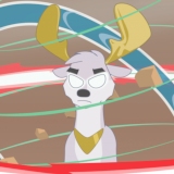
The legs and arms were based off of Boxer from the Animal Farm movie (which, oddly enough, also had a Whimper in it; the only human character to reach out to the animals). The face now has the same round base for the head as Scootaloo, but the muzzle is still mostly an original shape, adapted from Zod's pony creator (I think that was the name). The idea was that his snout be more angular, but still show both eyes in 3Q view, sort of a more masculine princess snout. He doesn't have the flat abs now, or a bulky chest. Not sure if I'd even add that in that perspective. The mane style is now no longer taken from Spitfire, but from a background stallion, called Star Hunter on the wiki. Fluttershy bumps into him during tornado practice.
The idea behind Whimper is and always was to have a colt who looked normal at one point and then bulked up, unlike Bulk Biceps, whose tiny hooves indicate he started off as more of a f/Featherweight.
Anyways, just 3Q view and front to do tomorrow, and then with a few more characters (Alicorn Armour Kid) see about rigging and posing. After that, who knows? Maybe some comics, or gifs, or just skip all that and make a tutorial, mark that off the New Year's list. It's weird, just looking at it, thinking it's finished, there's a dozen things that feel like they still need fixing, with perspective and posing and layers shifting to get the bulges right... I don't know how you actual artists do it. But I plan to find out, and keep trying, and eventually maybe learn to be satisfied as well as produce quality.
So, in the meantime, should I redo the cover art on Flight Camp with this version, and with proper background? Maybe a less awkward pose for Scootaloo? Or keep it as is, for nostalgia's sake and So Bad It's Good vibes?
I think this looks better than the original. Certainly better than the embarrassing purple and red he started off with.
Cracker out.
I like the new Whimper design overall, and it is an improvement. I keep frowning a little at the head, though. It just feels a little out of proportion to me. Of course, I have all sorts of trouble with proportion myself, so it could just be me. Just to play with it a little, here's Whimper with a slightly smaller head. (just a quick edit.)
s19.postimg.org/x7hlb9ng3/new_and_edited_whimper_by_xeregon_d9qvzeu.png
I'm not really sure this looks right either, but I'm sensing myself quickly sliding into the all-ponies-look-like-aliens zone...
--arcum42
Yeah, proportions remain the bane of my existence. Part of the reason it came out the way it did is because I'm doing everything based on a Scootaloo base, so I don't have to redo all the layer setups for animating. Rumble is obviously fine to do like that, but other colts... yeah, probably going to toy around with shrinking the head, then. It does look better, especially considering everything else is supposed to look bigger in comparison anyways. And the top mane needs tweaking so it looks more like it flows into the neck mane. So many things to do... At least Inkscape lets you see the numbers, so transformations can be carried over easily into other files.
So, let's see, that's giving him a breathing problem, bully issues, making him overly nervous, and now I'll be giving him microcephaly. How t(r)opical
Edit: I'm looking at the tweaks now and I think the main thing is to make the muzzle shorter on the back end, so the snout doesn't go that far back into the head. It's right on the current version, but that one's scaled down, and I forgot to do it on the original . I've also made the neck a little thicker. I guess the main reason I'm reluctant to actually shrink the head is because that was a problem on the original design; it looked more like a midget pony than a foal. But comparing it to Chip Mint, it does still look off, just a little. More research is needed, will be conducted. I dunno, I'm tempted to say it works as a weird-looking kid. After a while the long staring at the same character warps the perception of it, I find.
3742818
I'm horrid with proportions. I've spent a bunch of time tracing screenshots and coloring them, and inking and coloring other people's black and white sketches, or if the linework was good enough, just coloring them. My proportions are better then they used to be, but still not great enough that I'm ready to show them off.
In fact, the thing that's been the most promising for me so far is finding a pony in approximately the right pose, drawing a few circles and a bit of a skeleton over them on a separate layer, taking away the original picture, and then doing progressively less and less bad sketches based on the skeleton, on the premise that I'm good at improving pictures.
Sounds like a good plan, anyways. I totally agree with you about perception warping if you look at a picture too long. Sometimes I just have to put it away for a few days, then look back at it...
--arcum42