

Apr
17th
2024
Why do I write? Because it's fun! :D

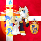
Soooo, due to popular demand, the old cover has returned, until I have made a better one. Thankfully I can still use the artwork, just without the text. But don't worry, you guys have your cute Luna back. 
Page generated in 0.093 seconds
Total duration
967 users online
2,031,909 hits today, 2,987,370 yesterday
My Little Pony: Friendship is Magic Fanfiction
Designed and coded by knighty & Xaquseg - © 2011-2024
![]() Support us
Support us
SubStar
![]() Chat!
Chat!
Discord
Follow us
Twitter
MLP: Friendship is Magic® - © 2024 Hasbro Inc.®
Fimfiction is in no way affiliated with or endorsed by Hasbro Inc.®

...I think you changed from gold to wood because the previous one was incredible and this one...well it's not that it's bad but there is no comparison, the previous one was thousands of times better
Perhaps, but that artwork was not mine. This one is.
5777168
I guess it's fair, it's always better to use what you own
Not bad, though the other was better.
I like it feels more personal other looked better but this is not bad :)
When new chapter?
I have to agree, the last cover was simply better. I wouldn't like to upset the artist, but Redchet Green's art is on a completely different level. Moreover, the text "High Score by DanishDash" is terribly readable in miniature.
5777237
I have to second this. The art isn't bad in the least but comparing the two just is not fair.
i would just change the font used in the logo lettering, but it looks cute!
can barely see the holes in the letter B in By DanishDash