
Jul
14th
2015
CHECK OUT THE NEW COVERART · 1:17am Jul 14th, 2015
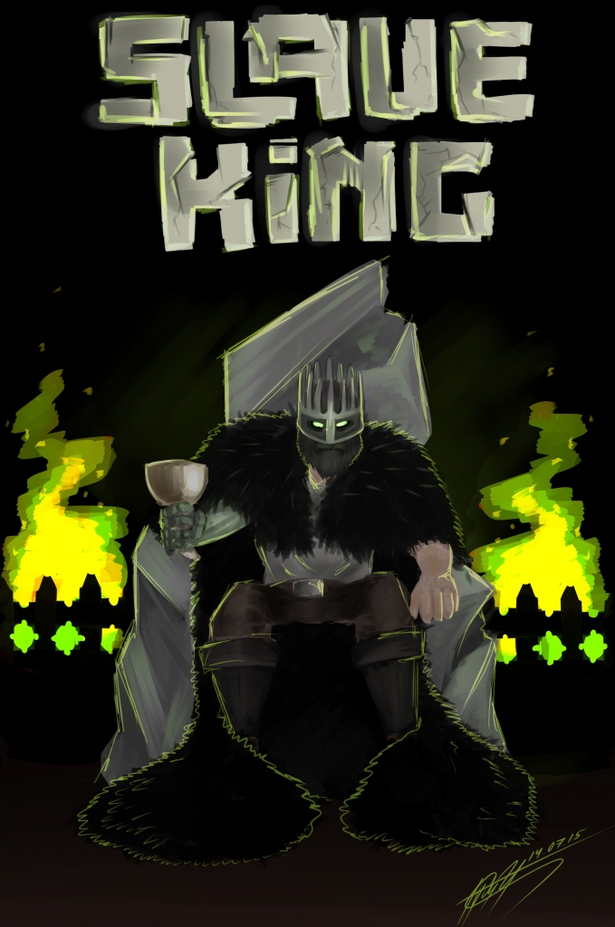
Gentlereader PoisonSt, decided that I needed some cover art, and so he graciously made some for me. He's looking for feedback on the art, so would you kindly please leave some feedback on the quality of the art, it would be greatly appreciated.
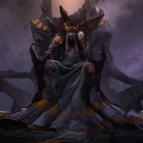
It's a good piece of art, I like it. Although honestly I prefer the old cover art, but I think it's more to do with the fact that the person depicted here looks a lot less like my mental image of the Slave King than the old image does. The stylised writing at the top is very well done though, I really do like that.
I thinks it looks great granted this is the first piece of work I seen from PoisonSt
It's a great pic of the Slave King. The old art may have better background and be more realistic but the Slave King looked weakened. Here he seems like a strong figure and his crown looks more menacing. I approve. It might not be a new chapter, but this cover art more than makes up for it.
M'kay, so quality.
Things I like/am impressed by:
You managed to make a good looking crown without too much of a way to visualize it. Not discrediting Talon, of course, it is simply difficult to imagine a crown meshed together with a mask.
Dat beard is so majestic. I wanna cry.
The title. I imagine it's difficult to make words that look like rocks.
The glowing green eyes. Definitely gives off the forbidding mood you were likely going for.
The very fact that you made some cover art for this amazing story. That alone earns you my respect.
Things I find awkward or dislike:
Not enough background. While darkness and the void certainly ooze fear and forboding, details are important when it comes to quality.
The forearm and hand aren't quite right, a bit too clunky, at least on the human side. The metal arm looks pretty badass.
Anything else I noticed I could be attributed to style or I'm not sure if I like or not. All in all, it came out well. Far better than I could do, I assure you.
Very ominous. I approve.
3236328 The reasons for the simple background, the artist ran out of memory on their pc, and couldn't add anymore layers. Originally they were going to place Nightmare and Scourge in the picture (to the Slave King's right and left, respectively), but due to running out of memory, decided to go with the flaming braziers instead. I sort of like the minimalist design myself.
3236505
Fair enough. Makes it that much more impressive