Buried Treasures (Stories that Deserve More Attention)
593 members · 690 stories
Join our SubscribeStar to remove these adverts!
Stats
Page generated in 0.054 seconds
Total duration
973 users online
427,386 hits today, 2,561,572 yesterday
FIMFiction
My Little Pony: Friendship is Magic Fanfiction
Designed and coded by knighty & Xaquseg - © 2011-2024
Follow & Support Us
![]() Support us
Support us
SubStar
![]() Chat!
Chat!
Discord
Follow us
Twitter
MLP: Friendship is Magic® - © 2024 Hasbro Inc.®
Fimfiction is in no way affiliated with or endorsed by Hasbro Inc.®
It was just occurring to me that this group doesn't have a banner. So I thought I'd just whip up a quick one. I figure with a name like "Buried Treasures", this'd be appropriate...
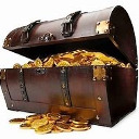
1120918 I could probably make a treasure chest surrounded by scrolls
1120924
A scroll and treasure chest would probably work pretty well as the group icon, since we should have one of those, too.
1120935
On it.Give me a week.1120942
Just keep in mind that the icon size is 100x100. And the banner size is 1000 x 250, btw.
Of course, it's up to Periphery and toafan whether any posted banners and icons get used, but I figure we might as well give them some options...
1120918
I haven't really given a banner much thought, but I have been thinking that something related to Daring Do and/or that Anubis statue might make a good icon for the group.
Not sure about sad/tired Daring, though. Hmm... Must ponder.
1121298
When I was going through screenshots, the one the banner was made from stood out as being easily cut down to size and scaled for a banner without getting distorted, as well as having both Daring Do and the idol in it.
If I have a chance later, I'll go through "Read It and Weep" and see if I see any other moments that'd work well for a banner...
1121298
Here, have a few other banner options. I went through the Daring Do sections of the episode looking for good shots:
Incidentally, can anyone see where I touched up the first one? I think I did a pretty good job of making the edit not be very noticeable...
1122382
I took a few screenshots like that 2nd one too, actually. And the 1st and 4th ones could also work. I have another idea as well, though, hmm...
I'm thinking I might cut one of those Daring Do shots into a square for the icon, then try my idea for the banner, but we'll see what looks best once I do it.
(First one of those five, or the one in your original post? If it's the one with Daring looking at the temple, I'd guess you edited the tree root and the bushes above it, so if that's not right, then I guess I can't tell without looking at the original scene.)
1122559
No, you're right. There was a Hub logo obscuring the tree root and bushes, and I had to edit it out. And for the bushes, that took some detail work because it was making it pretty hard to tell where the lines below it were. I think it looks pretty good for that.
I actually took more screenshots then this, but these were the usable ones. And I had several similar ones to 2, but decided just to do the one banner from that set...
1122382
I like the 4th one the best.
1122744
Well, after crashing my computer once in the process, my idea turned out to not work as well as I'd hoped. The biggest problem is that the scene I wanted to use was too tall, so it didn't look right in the dimensions for a banner.

Other problem is that it ended up over 18 MB, so I had to cut out every other frame to make it a somewhat more reasonable size. Also not sure an APNG would even work for a banner anyway, so I'll probably just use one of those Daring Do shots.
1126266
Never tried an animated banner, so I don't know if it'd work. And most of the animations I've seen on the site have been gifs.
I'm with you on the difficulty of getting things in the right dimensions. I load up the screenshot in Gimp, crop it to a long, narrow section, then tell it to scale the image, and see what length it gives me with a width of 1000. If it's more than 300, I keep cropping, or toss it out if I can't get it below that.
I scale to 1000x250 afterwards, but if it's from more than 1000x300, it usually looks noticeably distorted...
1126336
I did it pretty much the opposite way for this one, removed as much as I could from the top and bottom, then resized it to 250 pixels tall, and it ended up only 738 pixels wide. Well, since this is a side-scrolling scene, I could do a bunch of copy-pasting between frames to extend the edges, but it hardly seems worth that much effort. Even assuming it fit perfectly and everything, I'm still not sure if I like this scene I used more than the Daring Do ones.
1126336
Yeah, I just tested it out to see what would happen, and it wraps it around for the extra pixels, so it definitely doesn't work to have it too narrow. I could always put black or white bars at both ends, but I don't know. What do you think? Do you think the scene fits well in the first place?
1126429
I like the scene, but it really doesn't fit well in banner size.
I'd personally suggest using one of the Daring Do ones for the banner, and putting a larger picture of the apple scene on the front page. A lot of groups have a front page picture as well, and it might work well there.
1126459
Yeah, I definitely didn't want to crop any more off the top or bottom, and I'd really rather not distort the aspect ratio to make it fit. Right now I've got the banner set to a version with black bars at the sides, though, and it doesn't look too bad.
Part of the what I'm thinking is I do plan to use Daring Do/the statue for the icon and, and I wasn't sure if I wanted the banner to be so similar. Well, I'll think about it for a bit and decide if I want to change it.
This is what I get for not being an active mod.
The Daring Do/hat/statue banner we've got up there now looks good[1]. I'm down with that.
I support the scroll-in-a-treasure-chest idea for the group icon.
[1] Well, if you want to get technical, not actually good -- it looks a little washed out and grainy. Not sure why that is or what could be done about it.