


Jun
27th
2021
Well, that didn’t take too long. · 8:41pm Jun 27th, 2021
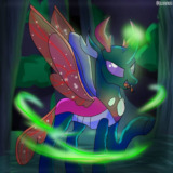
Cover art updated successfully, and so has the design of Nova Shadowlight.
And honestly, I’m more proud of the new cover art. Because the new character design gives off a much stronger Mary Sue vibe than the old one. That and the new cover art alone supports the tone of the story a lot more.
But I digress; what do you guys think?
Report
BezierBallad · 188 views
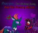
· Story: Pharynx, The Change Gang, And This Freaking Alicorn
·
#Mary Sue OC
Wow very nice
Ooh, nice
Nice
Question tho? Why’s there a Star of David?
5542299
It was one of the accessories available in Pony Creator. I didn’t know that’s what it was.
Might change it.
Edit: Fixed it and changed it to a regular choker.
5542304
You might want to change it, probably not the best idea to have a religious symbol as part of a cover image.
I... I hate it, but in a good way.
Also, fuck her dead eyed stare in the new cover art is creepy. I love it! Gives an eerie "you are mine" vibe.
5542307
Don’t worry, I’m already on it.
5542310
That’s exactly the vibe I was going for! Thank you!
Christ, this is horrifying.
Good job.
5542323
Thanks. I’m happy I came to this decision.
5542323
5542295
5542296
5542299
5542307
5542310
Just updated the chapters to fit the new Nova’s description a lot more. Feel free to check them out if you’d like.
5542347
Okay then
Oh god, the OC color burns
5542368
Mission accomplished.
⭐️Wow!⭐️That looks great! I love
the color scheme!💜💗💜🖤
5542529
You’re playing along, right?
5542534
Listen, I’ve been living under a rock and didn’t read anything underneath the image, I just saw the image and said what I felt,…pretty much~
5542535
Oh. I see.
Well, the character was meant to have more of an off-putting design, including the color scheme.
5542538
Well I mean, I like it BECAUSE I have never seen a combination like that. It gives a unique feeling.
5542542
Ah. I see now.
5542538
The color scheme really isn't bad, honestly. The blacks and reds aren't as overpowering as they usually are on Sue-type characters, mostly because all the purple between them goes pretty good with either color. Throw some lime green on there, that'll get people vomiting in a heartbeat. Maybe some orange on her horn if you REALLY want whining.
....Honestly though, the only really off-putting part of her design in my opinion is her eyes, which... let's be real, it's pretty easy to make those off-putting. Well, that and her shoes, but that's just me, because gold doesn't go very good with purple in my opinion.
5542570
Hm... I’m starting to see what you mean. Thanks for the input.
bravo. bravo. -sobs-