


"Human After All" Art Showcase! Sketches, Incompletes, and Concepts! · 11:32pm Jun 7th, 2018
As the title says, this post will be about the art of “The Iron Horse: Human After All” done by Greenfinger, my illustrator. Take a look!

Note: if you haven't read up through chapter 5, there will be some spoilers. Be forewarned.
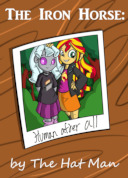
So, above we can see the original sketch for the cover. Note that Green typically doesn’t draw Turing’s pupils as square in the basic sketch. He usually squares them off for her human form in the finished colored version. Speaking of which…

Now this is the cover image again, but now it’s the finished version. As a bonus, though, you’re seeing the textless version, which is also a wider shot. Speaking of wider shots…

Turing Test in the bathroom mirror. Now, the image that appears in the story is actually cropped to show just Turing Test. The main reason is actually because of a detail I noticed after Green had completed the commission, but there wasn’t time to fix it and still get the story out on time. Namely, that we don’t see any bathroom stalls behind Turing. Additionally, there was a bit of fridge horror when I realized the girls’ bathroom had big, perfectly clear windows. That… could have some rather troublesome implications. Of course, my one regret about cutting it was the little bit of bathroom graffiti you can see on the right. While it makes no sense to be there in this context, you can probably guess what “TT MP” stands for.

This one’s a bit unique: it’s an in-progress illustration by Green that shows Gadget and her pantry without shading and partial coloring. I like that this lets you see more of the in-between process. Of course, Green had already included the Easter Eggs in this early version.

Here we have a line sketch of when Turing meets Human!Gadget for the first time. This is another wide-angle shot compared to the finished version. I liked the top part but felt that the characters looked shorter and younger than intended, so Green did another version that made them look slightly more mature. Another change is the position of their hands: in this one, their hands are downward, but the final version shows more of Gadget’s enthusiasm in the way she grasps Turing’s hands upwardly.

Another line sketch, this one of Turing Test seeing Sunset’s painting. A minor change here is Sunset’s expression. She looks uncertain here, but it was changed to a bigger smile. And, of course, you can see her blush in the final version. Still, I think this turned out super cute.
Okay, and now we move on to the most elaborate of the drawings so far! Here’s a look at the evolution of “Technomancer” Gadget (working title).
And first… (sigh) let’s see why I write and Green illustrates:

Here is MY concept art for the picture. Yeah, it’s fugly and the proportions are wrong, I know. I have often maintained that I know what good art looks like… but that doesn’t mean I can produce it myself. Still, it served to help Green try it out.

Line art sketch. Again, this one had the two characters looking a little too young, but Green nailed the picture. You’ll also note that Gadget is levitating here. In my original commission, I didn’t mention that, nor did I include it in my awful concept sketch. Instead, Green just said, “Hey, should she be levitating?” I blinked and went, “Oh. Yeah, pretty much every other EQG villain does when they transform. Go with it!”
But one thing I did tell Green was that he could elaborate on the original design. The concept and line sketch both just looked like regular ol’ Gadget with a nastier expression and some binary on her. Little did I know how Green would take the direction to “elaborate” and run with it. Thus…

...We get this! The first version of Technomancer Gadget! I really like the frayed coat, the green pattern on her clothes, and the additional streaks in her hair, not to mention the added wired and gizmos orbiting her fingers. You can also see that she looks a little taller and more angular. Still, I had two more changes to request: I asked that Turing’s expression look more shocked and that he try to create the white glow in Gadget’s glasses. It’s a semi-common trope in anime that adds an extra creepy effect as seen in this example I showed Green:

After that, he took it and turned out this:

And there you have it! The final version that appears in the story!
Well, I sure hope you all enjoyed this little behind-the-scenes peak! And remember that Green does still take commissions. Check him out on Twitter for prices and such if you want him to draw your character or something else you’d like to see, and you can also support him by checking out his Design by Humans store! You can get Human!Turing Test dressed as a waitress as a sticker or a coffee mug! And we have regular pony-version Turing Test too!
Remember, all profits go to the broke artist who draws you cute robots!
Until next time, everyone! See you!
Awesome!
Um. Time Turner + Muffins Patinki?
4878559
Who knew that was Derpy's real last name?
Man, Turing looks human in the linearts.
4879709
I noticed that too! In fact, upon seeing some of the original sketches, I often said to Green "Hey, remember Turing has square eyes," and he finally got annoyed and said "I know! For the last time, they only look round for the line art!"
Heh. I got told.