


Jul
22nd
2015
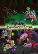
[Equestrian Earth] - Trixie the Flame Wticher's new design · 4:10am Jul 22nd, 2015
So I've been working with a couple artists who were very generous to lend a hand to helping me design Trixie's character in Equestrian Earth, and I'd like some feedback on them. Really genuine feedback. If you think something looks bad and could use changes, lemme know. Because, you know, the core design lies with me so if something doesn't look good or isn't appealing, let's talk.
First up, Trixie's Outfit.
Drawn by LyraAlluse
~If there is one thing I would change with this, it's the cape. It didn't actually turn out the way I thought it would look, which is a two-layered cape.
And here's her Flame Lantern Staff.
Drawn by Turning Gears
~Looks better than I initially had in mind.
Gonna go ahead and ask.
Why are the back legs white? Stockings I'm guessing, more of a why question.
Edit: the cape i must agree with, just plain bad.
3259403
I wanted to go with a Triss Merigold approach, who has tight black pants.
3259507 *looks that up*
Ohhhh now i see it, wasn't anything wrong just wondering why.
The back thing would look better if the big black thing was simply removed, but that's just my opinion.
3259509
Well thankfully I kept earlier variations that doesn't have the blue cape, and I gotta agree the blue part has to go.
pre03.deviantart.net/7daf/th/pre/f/2015/202/a/5/stock_reference___trixie_the_fire_witcher_v1_0_by_chaoticnote-d92b6b3.jpg
Here's the first variation of Trixie's design. This was, however, before the altered sleeves which I liked a lot. I'm not particularly good at photoshopping, unfortunately.
3259524 yeah the sleeve rip is cool, gives her that slight rogue feel. The main problem with the cape is the location, the part on top that in this pic is red, just looks so out of place right there. I understand what it and why it's there, but the placement is off and I'm sure exactly how to explain what i mean.
3259524 i think the word i was looking for was "bulky", it just seems heavy at the hips area, i know there's the fact a pony curves upward there, but even then it seems extra think.
3259524 pardon me for this post spam, this my last one for now.
Do you mind if i butcher that pic a tiny bit to show you what i mean?
I don't know if it's the cape not being long enough or the armor's general look itself, but it feels more like a Rogue set to me. I'm all for it, as Equestrian Earth is as much about style as it is about fighting things and questing, and a Rogue would fit Trixie's personality. But that cape still bothers me, it just feels like it's kinda there by obligation. As for the White leggings, it seems like it stands out a bit, I don't know why. Maybe they'd do better a bit darker? I really don't know anything about fashion...
3259735
Sure go ahead.
3259796
You're right about the cape, but somehow when I picture the darker leggings in my head, it clashes against the rest of the color scheme.
3260394 well i did the edit, but i have no way to post it.
3260541
Why? There's Deviant Art, Imugr, Photobucket, etc.
3260394 Then by all means keep it, the final choice rests with the creator, after all.
3260574 not worth the trouble for something i'm going to delete.
3260394
https://db.tt/5PSqGrGm
3260740
Hmm... I think I know what the problem is. It's the tail looking all rigid, and the cape should be draped over the legs more as somebody else told me.
3260785 exactly, it's bulk doesn't fit the width and length