

Jun
19th
2015
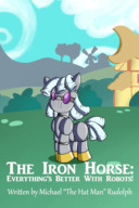
Possible new cover for "The Iron Horse" · 3:02am Jun 19th, 2015
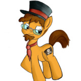
Hello dear readers! I'm currently thinking of replacing my current cover for "The Iron Horse" and going with something without text. I figure having the title isn't really necessary in this case, since it appears with the entry anyway. Here are some options. I'd genuinely like to know what everyone thinks is the most appealing version or if you prefer the current one.

Option 1

Option 2

Option 3
For the record, here's the current cover for comparison:

As you can see, I like the gear theme to accentuate Turing Test's mechanical nature. My collaborator is working on a few ideas as well that I might showcase later, but for right now, I'd like to know what folks think. Leave a comment and tell me your thoughts!
Report
The Hat Man · 347 views
· Story: The Iron Horse: Everything's Better With Robots!
·
#Covers
#The Iron Horse
Option 3 is the best
I like Option 3
I like option 2!
I think the warm colors are better for a fic about a robot trying to learn friendship.
Option #1 all the way.
option 3, definitely.
Option 1 has a lot of detail that I really like, but it feels wrong to have Turing off center like that.
The warmer colors of option 2 hold my preference.
I like option 2. 3's background doesn't match in terms of being hand drawn like Turing is. It just doesn't look right.
While I love 1 it seems to much for a cover so I'd have to say 2
My vote's for option #3.
I like Option 3 (I don't know why but Option 1 reminds me of Doctor Who, while Option 2 is a bit basic)
Option 3 with the text from Option 4.
Option 3
I'll vote for option 2. It gives the character a background, but doesn't draw the viewer's eye away from the character.
Option one, it shows just how complex she is.
3165272 3164091 3162400 3162297 3162122 3161921 3161908 3161894 3161857 3161729 3161661 3161653 3161645 3161638
Thank you very much everyone for the feedback so far! Your opinions and feedback greatly matter to me. Option #1 seemed to be the general loser out of the bunch, though it has been suggested that it might be because Turing is off center. I've redone the image to make it more similar to the others and would like to know if that changes anyone's mind. If you wish to change your vote, please let me know. If not, then you don't need to say anything.
Also, I should note that I'm considering a collection of "what ifs" and side stories that may use one of the other covers, so you might still see your choice used for that even if your first choice isn't selected for the main story.
3165790
ok
3165790 Yeah, it does look better with her centered, sort of like how she's effecting all the ponies around her and how they interact like the gears.
My choice is still Option 3, but now Option 1 is a good forerunner.
One thing that I think that is missing from the background is some allusion to electricity, like electric circuit diagrams - after all, Turing also have an electrical components.
"What Ifs" and Side Stories to the Iron Horse universe - that would be awesome!
3165790
My problem actually stemmed from the number of gears, While it does look cool, covers should be simpler because they are so often viewed as smaller thumbnails and can't afford to throw to much at the viewer. I still go for Option 2, simple, clean, and when you zoom out so it's 20% big, it just looks better.
3165790 I am a bit torn between option 3 and option 1. Now that it is centered I really like the colored gears. I am picking option 1.
I still like option 2, but now it's a harder choice.
They all have their strengths and their flaws. Option one has a background that has the same color scheme as Turing, but the gears are drawn in a slightly different style. Also, all the blues and greys make it feel cold and alien, and the enormous amount of gears make it hard to focus on. If you're moving the fic in a direction where Turing is alien and robotic and the characters have a hard time understanding her, you should go for option one.
Option two has a small amount of gears with cartoony shapes and warm colors. Since the number of gears is small, it's easy to focus on every part of the image. Plus, the warm colors make it feel friendly and inviting. However, the color scheme of the background gears contrasts slightly with Turing. If you want to show Turing as a friendly robot that's really trying her best, you should go for option two.
Option three, with the great amount of gears, and the cold blues and whites, contrasts sharply with Turing. Plus, it gives the feeling that we're looking at the blueprints of some great machine, but simultaneously it seems like Turing is floating or falling in some insanely complex blueprint space. If you want an adventure with lots of robotics, strategizing, and planning going on, then you should go for option three.