
How suck/not-suck is this cover art? · 1:39am Apr 20th, 2015
Hey folks. Next story is coming along, despite the kinks Season 5 is throwing in its path (Seriously, Babs Seed got her cutie mark? Off screen? For hairdressing? There's no way I could've planned for that). Chapter 1 is close, and I'll post it once I have Chapter 2 ready for editing so there hopefully won't be too long a break between updates.
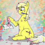
Before I can post the story, though, I need to finalize the cover art. But I haven't been feeling the artsiness lately, and my eyes have been too close to the piece I have managed to muck through. So I need you people to take a look at this monster and tell me if it makes you want to read anything associated with it:

Yeh? Meh? Bleh?
Anyhow, yeah. Applejack of All Trades will be available for your reading pleasure... soon-ish. If you'd like to help the process along, of course, there's still plenty of room for more pre-readers. Leoshi has been doing a lovely job for me so far, but Leoshi is but one person. More editors is more better. Send me a PM and I will link you where you need to go.
Thanks!
I'm not that fond of the pink on orange thing. Maybe add an outline?
Yeah, I don't think anyone saw that particular revelation coming.
As for the cover art, I'm certainly intrigued.
2998482 You mean an outline around the apples?
The pink's weird. A pastel isn't really supposed to go with a bright color like that. Maybe a more neutral color?
2998615 Sounds like the pink goes. Gray, maybe? White makes a lot of the cutie marks hard to see.
2998593
That was what I meant, give the apples an outline or border. Even if you change the color, it might be worth trying.
A nice medium-grey would probably work better than the pink.
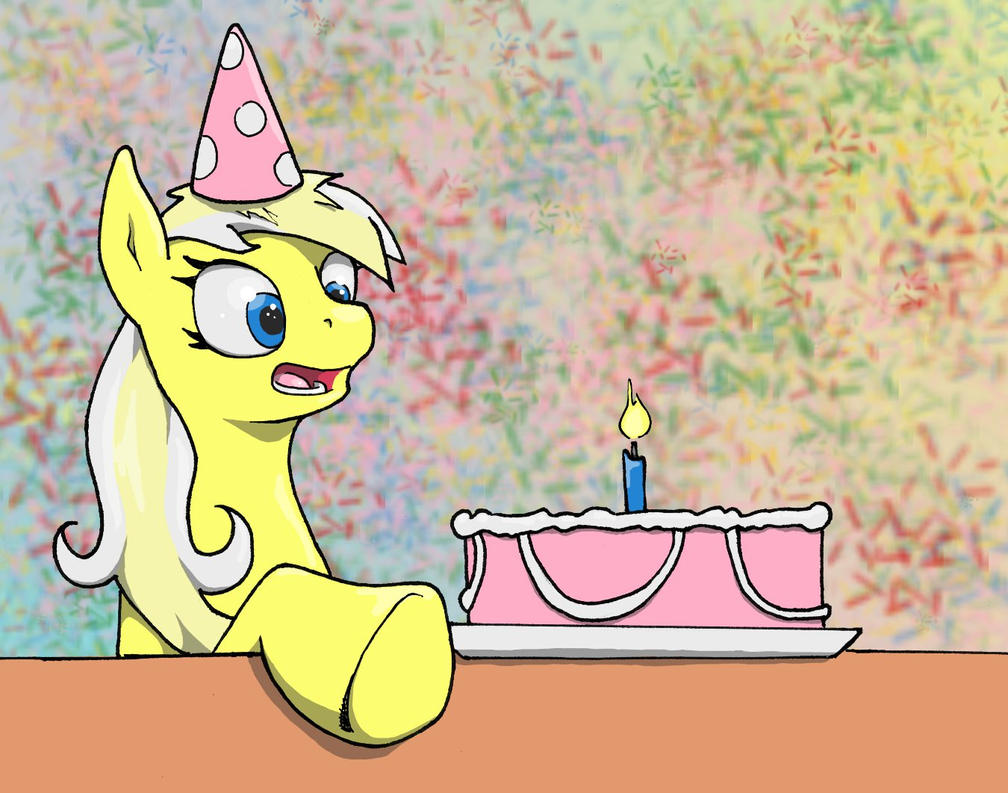
2998654 Here's a quick version with outlines and the pink replaced with gray:
i944.photobucket.com/albums/ad286/CptOffWhiteBeard/AJOAT%20Cover%20v2_zpsopslcmjm.jpg
Better?
2998741
Yes, that's much better.
Hi Esle.
Please don't be offended by this post. While I usually really like the stuff you put out, I'll not lie... I really don't like this cover art at all. It looks very... messy? Even with the black outlines, it's just not doing it for me.
Here's some of the things I can say that are bothering me.
1. Colour scheme should be complementary instead of analogous.
Most of the colours here, especially the title, uses analogous colours. This makes everything blend into everything else more, and it makes edges harder to find. This is part of the reason of what TiaC pointed out, I believe. Rather, for titles, especially ones that need to catch your eye (don't forget the title cards will be much smaller in a thumbnail even) ought to be placed with a complimentary (opposing) or neutral colour like black or white. A black and white border helps, but in this case not so much. In your picture, everything uses an analogous colour to orange - pink and red, so it's very hard to pick things out.
2. Background colour choice
In essence, that pastel orange is really a bad colour to use for a background. It's muddy and too striking, and it isn't a very... 'nice' colour to look at. I would suggest, in this case, along with point 1, using a netural or complimentary colour for the background, and keeping your title a more base orange if that is what you're going for. And while I know that the background is meant to reflect Applejack, it isn't working out here too much for me, especially with the gradation. Keep it flat, too.
3. Picture is too busy
There's too many elements going on at once. The pictures within THREE separate apples aren't even going to come out when the picture is shrunk down to FimFic size, and you can bet that no one's going to click on it to blow it up to take a closer look. It's meant to capture the idea at a glance. I like the concept, but right now, it's just too much for anyone to understand with a single look. Thusly, it just comes off as messy and cluttered, and not attractive. I would suggest ONE apple for the picture. we don't need to have all three to know it represents Applejack. Minimalism tells a better story in a shorter period of time.
4. Composition
The title isn't centered or aligned. It's stacked. It's placed OVER picture elements. This would be the same as having the title on a movie poster covering people's faces or important things going on in the background. It just comes across unprofessional and feels like there wasn't much thought put into what goes where. The title should own its own space; the elements of the picture should own their own spaces. The apple is sort of dangling there. There's absolutely nothing in the top left corner, which creates a weird eye-vortex.
5. The font
Change it. It's terrible.
Once again, I'm sorry to have to sound so harsh in my feedback, but I actually DO want to make sure you have a good piece of cover art for the story that you worked so hard on. I would actually recommend you taking the time to think of some other element of the story to create the cover art about. If you can even scrap this entire concept altogether, I'd suggest working from start -- even if you use the same idea. It just needs to be built up from the ground up with more attention to what goes where, and in my experience I've found that trying to 'repair' something is more distracting than starting afresh on the exact same idea.
I hope this feedback can help you. Please don't hesitate to poke me if you need me to clarify anything.
2998785 ur meen, u dont liek mai arts
Nah, thanks for being honest. Like I said, I haven't been arting for shit lately, and part of that is that my eye for these sorts of compositional elements has simply deserted me. I'll probably take your suggestion to scrap this and start over; I had another idea for it that involved a cityscape, but I went with this one because it was less work and there aren't a lot of good reference screencaps for Manehattan and did I mention this one was less work?
The font, though... It's this, Papyrus, or Comic Sans. Take your pick.
2998830
Die. die now.
But you should use a clear sans serif (serif doesn't work good for titles) and you want something not so thick. When I shrank down what you had, the holes in the P's and R's and A's were so small that it all ran together.
Also I'd suggest try avoiding italics, and to avoid splitting the title if you can. Keep spaces between clear. Fiddle with kerning, too. Art programs usually have a setting when laying down font to mess with kerning.
Good luck!
And as always, let me know if I can help.
I'd suggest putting an outline around the letters too.
Assuming it's not too late.